A ground-up redesign of a tandem-paragliding operator's website - turning a generic
booking page into a fast, bilingual, WhatsApp-first conversion path built for an international tourism
audience.
DE/EN layerData-attribute dictionary over the finished markup, no
rebuild
Grounded in real booking behaviour - phone + WhatsApp, not
assumptions
Built for two traveller personas, not a generic visitor
Zero dependencies - plain HTML, CSS, vanilla JS
5 pages, 1 token system - no per-page rebuilds
02 - The Brief
A local operator running on a template site.
Sooperfly Tandemparagliding flies 600+ tandem flights a year over the Stubaital - but the
website looked like every other small-business template: single language, unclear pricing, and a booking
path that made visitors work to hand over money.
Before the redesign
✕German-only - no path for the German,
Dutch, Scandinavian and American tourists who book the majority of flights
✕Pricing buried below generic stock
imagery, no comparison between flight types
✕No dedicated booking flow - visitors had
to find a phone number and call
✕Mobile nav and legal page felt like an
afterthought, not part of the same brand
What it needed
✓DE/EN switch persisted
across pages via localStorage - no page reload dead-ends
✓Comparable price cards
with a featured recommendation and a gift-voucher path
✓WhatsApp-first booking
- the channel this audience already messages on, one tap from the hero
✓One consistent system
across home, shop, contact and both legal pages (Impressum, AGB)
03 - The Original Site
Not a mock-up - the actual live site.
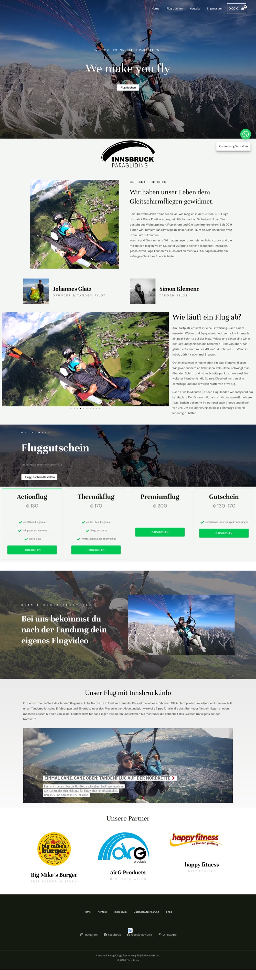
Both frames below are real screenshots, not redrawn templates - the original
innsbruck-paragliding.at on the left exactly as it shipped at the time of writing, next to a
screenshot of the rebuild on the right.
Before · Live Siteinnsbruck-paragliding.at
innsbruck-paragliding.at
German-only nav, a cookie modal that covers the CTA on load, and a single
hero image doing the job an entire page should be doing.
Screenshot taken at the time of writing - the live site may have changed
since.
After · Redesignthis repository
../Paragliding/index.html
A DE/EN toggle, a stats strip that states 600+ flights up front, and a hero
CTA nothing sits on top of. A live, interactive render of this same homepage at three widths is further
down in Responsive.
01
No English version - for an audience that's barely German
Every nav label, price description and FAQ answer exists only in German.
But the two traveller profiles this operator actually books - detailed just below - skew German,
Dutch, Danish, Swedish and American. For most visitors, evaluating trust, price and safety policy
means translating the page themselves first.
→ Highest-impact finding
02
Cookie modal blocks the hero CTA
On load, the consent dialog covers roughly half the viewport - including the "Flug Buchen" button -
and didn't reliably dismiss on the first click during testing.
03
No pricing above the fold
Flight types and prices live several scrolls down, with no way to compare Actionflug vs. Thermikflug
vs. Premiumflug before committing to read the whole page.
04
Zero visible trust signals
No testimonials, review count or star rating anywhere on the homepage - despite the operator flying
600+ tandem flights a year.
05
No FAQ, no objection handling
Weight limits, weather cancellations and voucher redemption aren't addressed on the page - each
becomes a message a visitor has to type by hand.
06
WhatsApp is a floating afterthought
The only fast booking path on mobile is a bubble in the corner - not a guided flow, not pre-filled
with a flight type or date.
07
No shared design system
Typography, spacing and button style shift from section to section - a stock template stitched
together, not one product.
The Gap
600+ flights a year. Zero of them bookable in
English.
04 - Who's Booking
Who Was I Designing For?
Almost nobody landing on this site is local. Bookings skew heavily German, Dutch,
Danish, Swedish and American - holidaymakers in the Stubaital for a week, not locals browsing on a
Tuesday. Before building deep personas, I mapped every visitor type the redesign actually had to serve.
Core Audience
International Holidaymakers
DE / NL / DK / SE tourists building a Tirol itinerary from home, days or weeks before arrival. Need
to evaluate trust and pricing without translating the page.
The Gap
English-Speaking Tourists
US / UK / AUS visitors with little or no German. The old site gave them nothing to read - the single
biggest gap this redesign had to close.
High Urgency
Spontaneous Walk-Ins
Sees paragliders overhead, decides same-day. Needs a three-second call-to-action, not a page to
read.
Seasonal
Gift Voucher Buyers
Buying for someone else, often not flying themselves - needs a clear, standalone gift path, not a
booking form built for the flier.
Post-Flight
Past Guests
Returning for video or photo purchases, or to leave a review - a second touchpoint the old site did
nothing to capture.
Referral
Hotels & Local Partners
Concierge desks and hostel staff who recommend the operator - need a page credible enough to point a
guest to without hesitation.
Two Profiles, Mapped in Depth
From that list, two patterns did almost all of the booking - so those are the two built out in full
below.
Profile A
The Planning Couple
DE / NL · booking 1-3 weeks before arrival
Primary goalLock in a trustworthy
operator before the trip
Trigger momentBuilding the Tirol holiday
itinerary at home
Site only in German - can't fully evaluate the offer
No side-by-side view of flight types and prices
Unsure what happens if the weather doesn't cooperate
"We book activities weeks ahead so the week isn't wasted searching. I need to compare prices without
translating every line."
Profile A · Composite voice
Profile B
The Spontaneous Traveller
SE / DK / US · decides same day or next
Primary goalBook a flight for tomorrow,
get instant confirmation
Trigger momentSpots paragliders over the
valley, hostel recommendation
Biggest fearSlow reply, no availability,
clunky mobile checkout
DevicePhone, standing outside, already
on WhatsApp
Core pain points
Doesn't want to read - wants a call-to-action in three seconds
Phone-only contact means waiting for someone to pick up
Mobile menus that hide the booking action behind taps
"I'm not planning three weeks out. If I can't message you in the next minute, I'll book with whoever
answers."
Profile B · Composite voice
05 - Customer Journey
From holiday research to landing gear.
Mapped across both personas - where the old site lost people, and where each rebuilt
page picks them back up.
Discovery
Planning the trip
Comparison
Choosing a flight type
Booking
Committing to a date
Day of Flight
Weather-dependent
After
Sharing & reviewing
Actions
Searches "paragliding Innsbruck" on Google/TripAdvisor while planning the Tirol trip
Opens the shop page, compares Thermikflug vs Actionflug vs Premium pricing
Taps WhatsApp CTA or fills the hero booking widget with a preferred date
Checks for a weather-reschedule message, meets at the pickup point
Buys the flight video/photos, leaves a Google review
Touchpoints
Google search · TripAdvisor · hotel/hostel recommendation
Shop page · price cards · FAQ accordion
Hero booking widget · WhatsApp deep link · floating WhatsApp button
WhatsApp thread · pickup coordination
Instagram/Google review prompts
Thinking
"Is this a real operator, and can I even read this site?"
"What's actually the difference between these three flights?"
"This is the app I already use - I'm not calling a landline abroad."
"Will they tell me if it's cancelled, or do I just show up?"
"That was worth it - I want the video before I forget."
Emotions
ScepticalCurious
ComparingReassured
ConfidentIn control
AnxiousExcited
ProudGrateful
Experience
Pain Points
German-only content · generic template feel · no trust signal
Prices buried under stock photography, hard to compare
Phone-only contact, unclear from abroad if anyone will answer
No visible weather/reschedule policy
No prompt to leave feedback or reorder photos/video
Opportunities
↑ DE/EN toggle↑ Real trust
strip
↑ Scannable price cards↑ FAQ up
front
↑ WhatsApp deep link↑ Hero booking
widget
↑ Free rescheduling promise
↑ Google review CTA
Site Response
Language toggle in nav on every page · trust strip with response time
Featured price card + comparison list · FAQ accordion open by default
Hero widget builds a pre-filled WhatsApp message with flight type + date
"Kostenlose Terminänderung" stated on shop & contact pages
Social links and Google reviews surfaced in the footer
06 - Design System
Built on tokens, not one-off styles.
Every colour, radius and spacing value lives as a CSS custom property, shared across all
five pages - so the site reads as one product, not five separate builds.
A floating nav with a scroll-aware light/dark state, a persistent cart badge, and a DE/EN
pill that swaps every data-i18n element in place. The chosen language is saved to
localStorage, so it survives navigation between all five pages.
localStorage.setItem('ip_lang')
INNSBRUCK PARAGLIDING
Flug buchen
Sechs Erlebnisse
über dem Stubaital - wähle deinen Flug, den Rest übernehmen wir.
07 - Solution 02
Pricing you can compare at a glance
Six flight types collapsed into scannable cards - one featured with a pilot quote, a
gift-voucher banner for the "not sure which flight" gift-buyer, and a mouse-follow spotlight so the cards
feel alive on hover, not static.
--mx / --my
spotlight vars
Thermikflug · Empfehlung
€170
Der längste reguläre Flug: über 30 Minuten in der Luft, viel Zeit für das Bergpanorama.
Answering objections before they're typed into WhatsApp
Weight limits, bad-weather policy, rescheduling, age minimums - the questions that
otherwise turn into back-and-forth messages, answered inline on the shop page as an accordion, first
item open by default so the pattern is obvious immediately.
Wir fliegen Gäste von ca. 15 kg bis 125 kg. Bei Abweichungen sprich uns vor der Buchung kurz an.
Sicherheit geht vor. Wetterbedingt verschieben wir deinen Termin kostenlos - so oft wie nötig.
Gutscheincode bei der Terminvereinbarung angeben - ein Jahr gültig, für jeden Flugtyp einlösbar.
08 - Craft
Two bugs that only show up after launch.
The kind of issues QA finds on a real phone, not in a design file - both traced back to
how CSS actually resolves stacking and specificity, not surface-level styling.
01
Sort dropdown rendering behind product cards
The shop toolbar's dropdown had a higher z-index than the cards below it - yet still painted
underneath them. Root cause: the toolbar's scroll-reveal transform created its own
stacking context, trapping the dropdown's z-index inside it while sibling cards - also transformed -
formed later, higher-painting contexts of their own.
Fix
.shop-toolbar { z-index: 6; }
/* transform already grants z-index
   eligibility - no position:relative
   needed on the toolbar itself */
02
Active mobile nav link invisible after scroll
The current-page link was meant to show in accent orange on mobile. It worked - until the menu was
opened after scrolling past 80px, when a same-context nav.scrolled rule with higher
specificity silently overrode it back to near-black on a dark overlay.
Fix
nav.scrolled .nav-links
  a[aria-current="page"] {
  color: var(--color-accent);
}
/* equal specificity, later in the
   cascade - wins without !important */
09 - Iterations
The first version wasn't the shipped one.
Two decisions that changed after the initial build - not comps rejected in a design
file, but real revisions made once the pages actually existed.
V1 - Shipped first
Shop page, no FAQ
The shop page launched with just the six flight cards and a trust strip - pricing and booking, and
nothing else.
V2 - Revised
7-question FAQ, first item open
Added an accordion answering weight limits, weather policy, rescheduling and voucher redemption -
the exact questions that would otherwise land in the WhatsApp inbox one by one.
Why
Every unanswered question on the page is a question asked by
hand later, in a second language, on a phone. Cheaper to answer it once, in writing, than every time.
V1 - Shipped first
"2019" badge clipped on mobile
The founding-year badge on the story photo used a negative offset to overlap the image edge -
intentional on desktop, but the photo container's overflow:hidden cut the badge's own
corners off on narrower screens.
V2 - Revised
Border-radius moved to the image, not the wrapper
Rounded the image itself instead of clipping its container, freeing the badge to sit on top without
being cropped by the same box it was meant to overlap.
Why
The bug only showed up once revealed on a real phone width - a
reminder that overflow:hidden clips everything inside it, including elements meant to
break out of it on purpose.
10 - Localisation
A translation layer, not a second site.
No CMS, no backend, no build step - so the DE/EN switch had to work as a thin layer over
the existing markup, safe to add to a static four-page site without rebuilding any of it.
1
data-i18n="hero.cta1"Tag every translatable element with a key, once
2
I18N = { de:{}, en:{...} }One dictionary object per page, EN values only
3
applyLang(lang)Walks [data-i18n], swaps innerHTML, toggles .active state
4
localStorage.setItem('ip_lang')Choice persists across all five pages, no reload
flash
11 - Responsive
One system, three widths.
The nav collapses at 860px, not by accident - it's the point real content started
colliding on a tested device. These are the live pages rendered at three real widths, not redrawn
templates.
1440px
Desktop> 860px - full nav inline
768px
Tablet768px - nav collapses to burger
390px
Mobile375-390px - the exact device the Craft fix above
targets
12 - Impact
What actually changed.
No analytics history exists for the old site to quote a conversion lift from - so
rather than invent one, here's what measurably shipped.
Metric
Before
After
Languages served
1 - German only
2 - German + English
Booking channel
Phone number only
WhatsApp deep-link + phone
Pre-booking objections answered on-page
0
7 (FAQ accordion)
External JS/CSS frameworks
Unaudited theme bundle
0 - vanilla HTML/CSS/JS
Known accessibility/contrast bugs
-
2 found & fixed (see Craft)
Pages sharing one design-token system
Inconsistent per-page
4 of 4
13 - Result
Five pages, one system, zero dependencies.
5
fully responsive pages sharing one token system
2
languages, persisted across navigation
0
external frameworks - plain HTML, CSS, JS
1
tap from hero to a WhatsApp booking request
Built for the channel this audience already uses, in the language they actually
read - and left simple enough for a solo operator to hand off to a booking plugin later without a rebuild.
Deliberate scope
The hero booking widget hands off to WhatsApp rather than processing payment - that's intentional, not
a gap. A one-person operation needed a live, bilingual site fast; real-time availability and card
payment are scoped for a follow-up phase on a booking plugin (Amelia / WooCommerce Bookings), once the
business is ready to commit to that overhead.