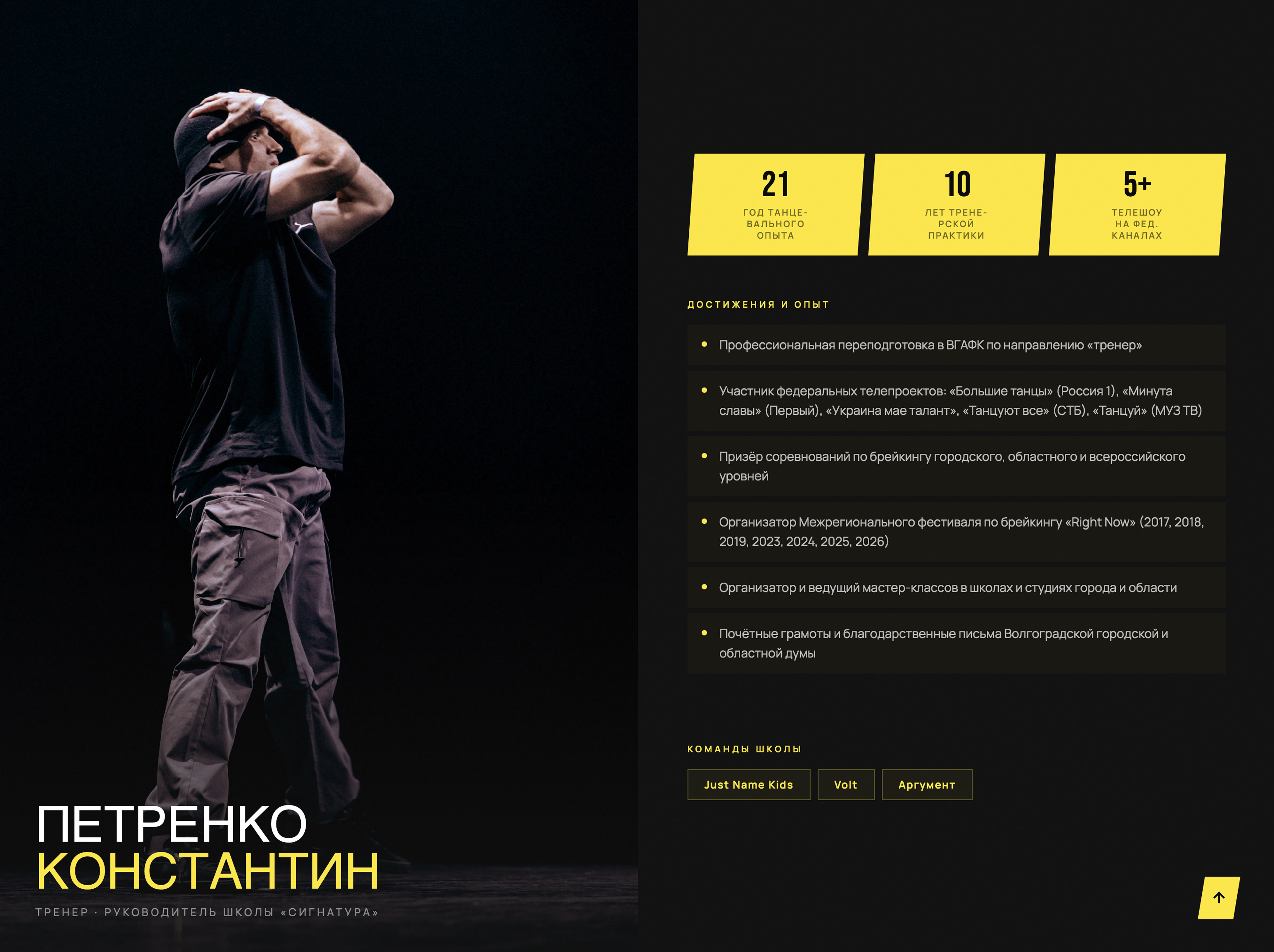
UX Research · UI Design · Frontend Dev
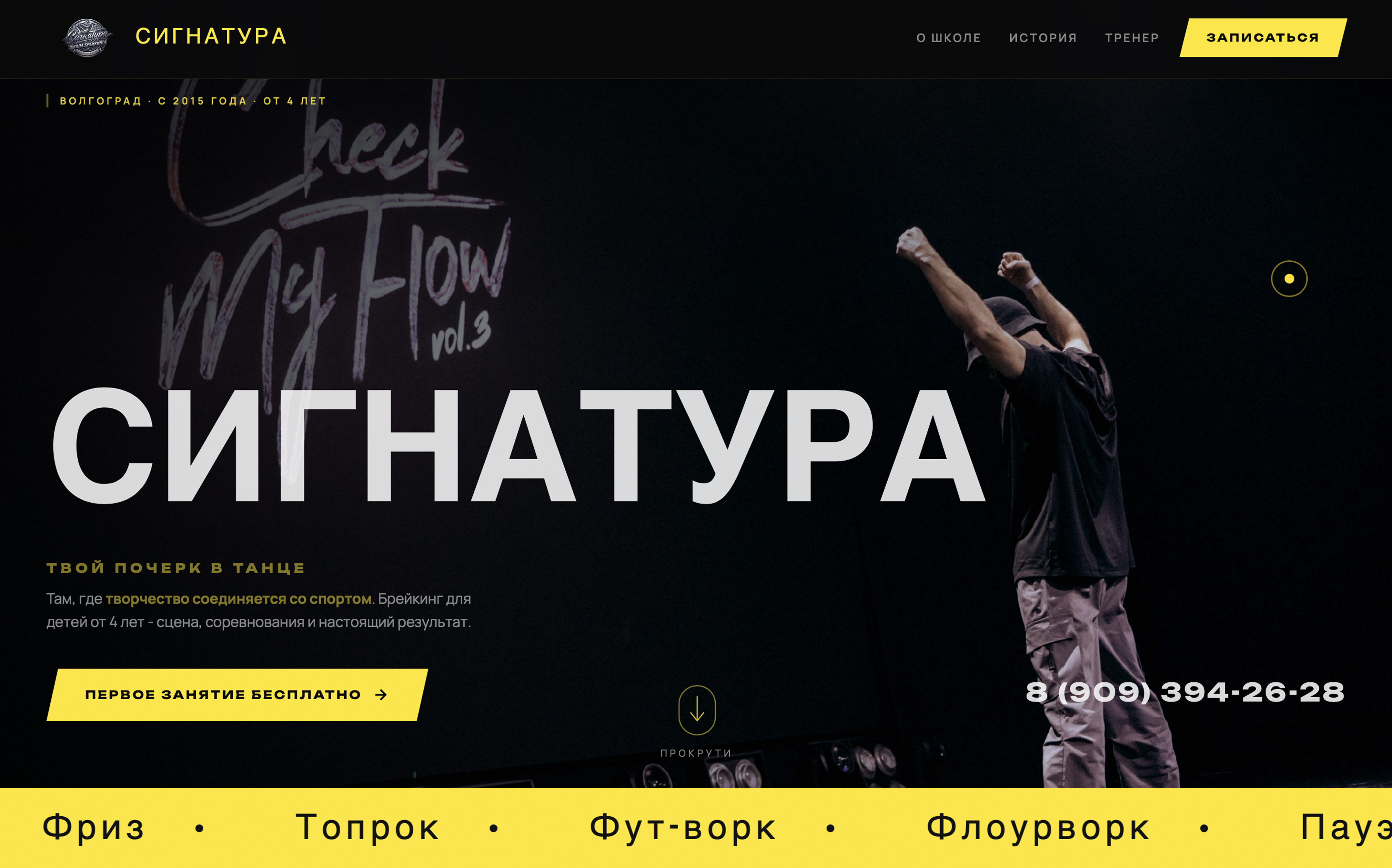
SIGNATURA

Your signature in dance - Volgograd's breaking school

End-to-end design and development of a first-ever website for a competitive breakdancing school in Volgograd, Russia - converting word-of-mouth reputation into a digital presence that drives free trial class sign-ups for students aged 4 and up.
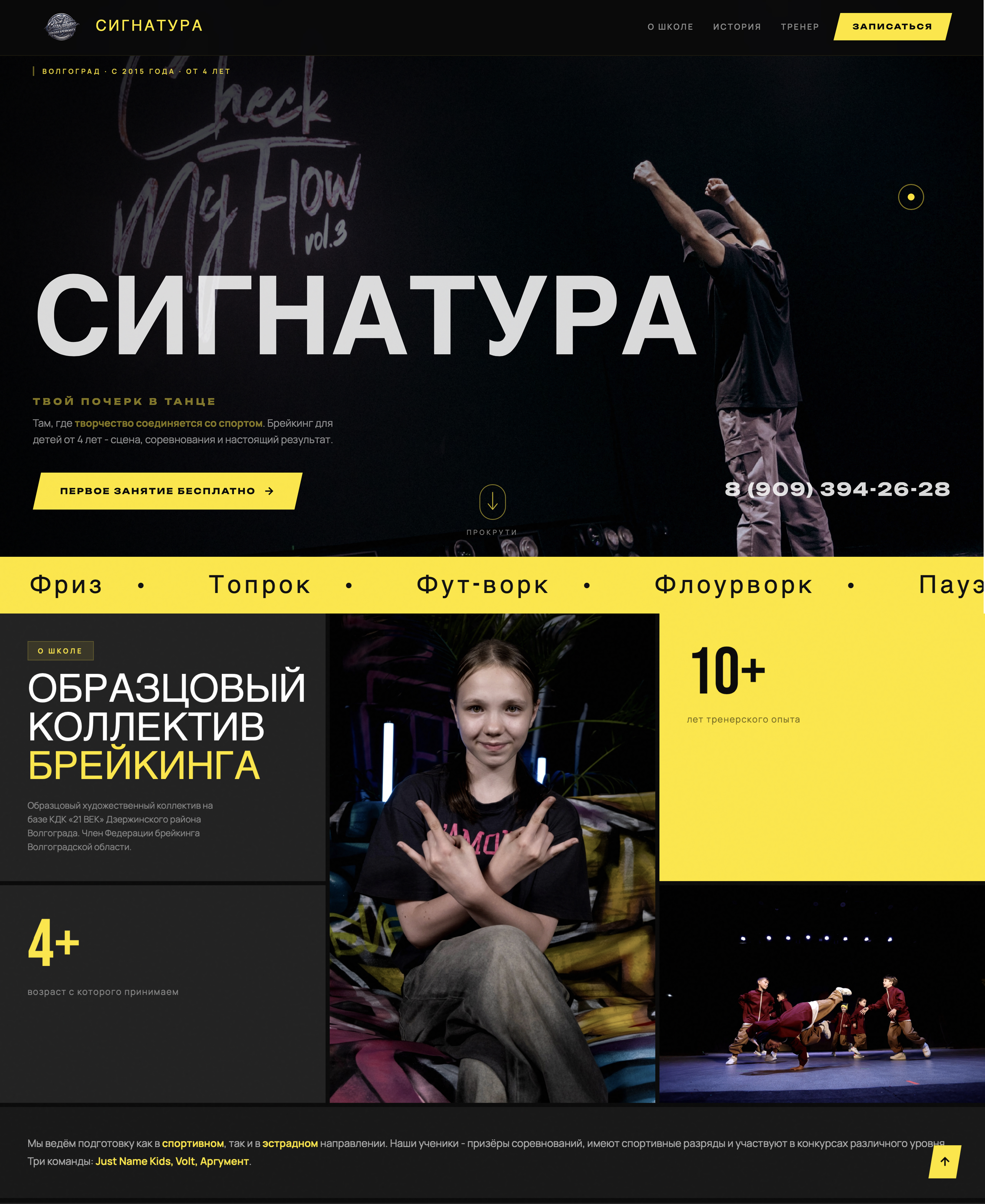
Role UX/UI · Frontend Dev
Duration 4 weeks
Type Freelance
Country Russia 🇷🇺
Signatura website

Website screenshot

assets/img/case-img/signatura-hero.jpg
0→1
First digital presence - built from zero
Client
Signatura Breaking School
Volgograd, Russia
Deliverables
Brief · Research · UX Flow
UI Design · Frontend · Legal Docs
Tools
Figma · HTML / CSS / JS
Tilda · Yandex.Metrika
Status
Deployed to Tilda
signatura-volgograd.ru
01 - Process

Design Process

A four-phase approach that took a school with zero digital footprint to a live, conversion-focused website - anchored in a real client brief and direct communication with the founder.

01
Discover
Brief · AuditClient interview, competitive scan, no-website diagnosis
02
Define
Personas · HMW3 user types, goals, pain points, key questions
03
Design
IA · UI · SystemSitemap, user flow, dark editorial design system
04
Deliver
Dev · Tilda · LegalCoded prototype → Tilda migration → Russian compliance docs
Duration: 4 weeks
Tools: Figma · HTML/CSS/JS · Tilda
Solo delivery: UX + UI + frontend + legal
Client: Konstantin Petrenko
02 - Context

The school everyone knew -
but couldn't find online

Signatura has been shaping young b-boys and b-girls in Volgograd since 2015. TV appearances, national competitions, a decade of awards - and not a single web page to show for it.

The School
10 years of competitive excellence

Founded in 2015 inside the Cultural Centre «21 Vek» in Dzerzhinsky district, Volgograd. The founding trio went from local shows to national TV - Minuta Slavy (Channel 1 Russia), Ukraine Got Talent (STB), Tantsuy (MUZ-TV), Bolshie Tantsy (Russia-1).

Model collective under the Regional Federation of Breaking
Groups for ages 4+ - sport and performing tracks
Teams: Just name kids, Volt, Argument
Right Now festival organiser (2017–2026)
The Problem
Growth capped by zero digital presence

Parents searching for dance classes in Volgograd found competitors first. The school had no way to show its credentials, showcase results, or let prospective students take the first step independently.

No website, no landing page, no Google Maps listing
VK/Instagram reach existed but lacked a destination
Enquiries required calling a single phone number
Award-winning credentials invisible to new audiences

"We want to grow the school and increase its visibility - so we decided to build a website. We never had one before."

- Konstantin Petrenko, Head Coach & Founder · from the client brief
03 - Research

What the landscape told us

Three types of competitors exist in Volgograd's children's dance market. None combined premium credentialing with a clear conversion path to a free trial class.

Municipal Dance Centres
Generic
Basic pages, mostly informational
No sport credentialing visible
Weak CTAs - no trial class flow
Generic multi-discipline positioning
Private Dance Studios
Stronger UX
VK/Instagram as primary acquisition
Some use Tilda or Wix landing pages
Better visuals, shallow credibility proof
Trial CTA present but buried
Top-Tier Sports Sections
Trust gap
Clear achievements, outdated design
Hard to navigate for parents
No emotional warmth or community feel
Registration forms, not invitations
Key insight: No competitor combined sporting credibility (competition results, federation membership, TV appearances) with a warm, parent-friendly conversion path to a free trial class. Signatura could own both - if given a website that showed what it truly is.
04 - Personas

Three people who need this site

User types mapped from the brief, competitive research, and the school's actual audience - children from 4 years old, with parents as primary decision-makers.

Marina
Mother of a 6-year-old · Primary decision-maker
«I want my son to be active and disciplined. But I need to trust the coach before committing to anything.»
Proof the coach is qualified and experienced
What ages and levels are accepted
Easy sign-up - no cold calls upfront
See the venue and schedule before visiting
Parent
Dima
Teenager, 14 · Aspiring competitor
«I want to compete seriously. I need a school that goes to real championships - not just shows.»
Competition results and sporting achievements
Path to federation-level competition
Connect with the school's identity and culture
Training intensity that matches his ambition
Teen · Athlete
Elena
Event organiser · City partnership
«We want a breaking performance at our city event. Can this school deliver? Are they legit?»
Verify the school is an official, recognised body
Media evidence - TV appearances, awards
Direct contact without a long form
Professional first impression
Organiser
05 - How Might We

Design questions that shaped every decision

Three core How Might We questions emerged from research and became the foundation for every structural, visual, and content decision made throughout the project.

01
How might we convey 10 years of competitive credibility instantly - without a wall of text?
Visual storytelling - stats, TV show names, trophy counts, and a coach bio that reads like a résumé.
02
How might we make a parent of a 4-year-old feel safe enough to book a trial class right now?
Clear age targeting, warm tone, free trial framing, and a phone CTA visible on every scroll position.
03
How might we visually separate Signatura from every generic dance studio page in Volgograd?
Dark cinematic system - Bebas Neue headlines, electric yellow, bento grid - that looks like a sport brand, not a community board.
06 - Information Architecture

One page - seven answers

Single-page architecture sequenced to answer the visitor's questions in the exact order a parent or teenager would ask them - from "is this real?" to "how do I join?"

signatura-volgograd.ru
Hero
Tagline + CTA
Phone visible
About
Founded 2015
TV appearances
Federation
Directions
Sport & Stage
Ages 4+
Coach
21 yrs experience
Certified trainer
Festival organiser
Achievements
Results bento
Awards grid
Sign Up
Free trial CTA
Phone + map
07 - User Flow

From curious to booked

The primary conversion flow - a parent who discovers the school online and decides to book a free trial class for their child - mapped out in six steps.

Discovery
VK / word of mouth / search
Hero Section
First impression, slogan, CTA
Credibility Scan
About, coach bio, TV mentions
Results Check
Achievements bento, sport grades
Decision
CTA - free trial, phone
Enrolled
Free trial booked by call
08 - Design System

Built for sport energy

A dark, editorial system - cinematic and bold - that signals competitive seriousness and stands apart from every pastel dance-class brochure in the Russian market.

Colour Palette
Ink #080808
Yellow #FFE600
Surface #191919
Raised #2C2C2C
Dim
Typography
BEBAS NEUE
Playfair Display
Manrope for body copy
Unbounded for UI labels
Visual Principles
Dark backgrounds - cinema, not classroom
Electric yellow as the only accent
Bento grid for achievements section
Grain texture overlay - raw energy
Custom cursor with mix-blend-mode
Components
Fixed nav with backdrop blur
Scroll-reveal animations
Mobile hamburger menu
Sticky phone CTA button
Bento achievement cards
KEY
CALLS
1
Dark theme in a market of light sites. Every competitor uses white or pastel. A dark, cinematic system made Signatura look like a global sport brand - not a community notice board.
2
Phone-first CTA - not a form. In Russia, a phone call is the dominant trust signal for service purchases. The CTA is a direct call link, not a web form that creates friction.
3
Bebas Neue as the display face. Already embedded in the Signatura brand - using it as the headline font created instant recognition between the website and all physical materials.
10 - Screens

The site, section by section

Every section designed to answer a specific question in the parent or athlete's decision journey.

Hero
Hero - SIGNATURA
Full-bleed · Slogan · Phone CTA · Ticker
0→1
First digital presence, built entirely from scratch
About
About the School
Bento grid · Stats 10+ & 4+ · Two tracks
History
History - Since 2015
TV shows · Just Name · Founded 2015
Philosophy
Our Philosophy
Philosophy · CTA · Split yellow/dark
For whom
Find Your Path
5 directions · Sport · Stage · Team · Zero exp
10+ years of achievements made visible
Sport grades, TV credits, competition results - all in one place for the first time
Achievements
Achievements
Bento grid · Awards · Sport grades · Results
Gallery
School Gallery
Photo bento · Competitions · Performances
CTA
Sign Up - Free Trial
Free trial · Form · Phone · Address
11 - Impact

From invisible to searchable

A first-ever web presence transformed Signatura's ability to reach new students - turning a decade of offline reputation into a searchable, conversion-ready digital identity.

0→1
Online presence created
entirely from scratch
6
Content sections designed
end-to-end
10+
Years of achievements
made visible online
4wk
Brief to live site -
solo delivery
12 - Constraints & Trade-offs

What I had to work around

Senior design is about decisions under constraints - what got built, what got cut, and why.

Russia-specific deployment: Tilda over GitHub Pages

The original prototype was built in clean HTML/CSS/JS. Deploying on GitHub Pages would have resulted in slow load times from Russia, potential access issues, and no Yandex.Metrika compatibility - the analytics standard in the Russian market.

Trade-off

Rebuilt on Tilda for production - the dominant Russian landing page platform with Yandex hosting, native analytics integration, and guaranteed fast load speeds. Design fidelity was preserved; the stack was swapped for the audience's reality.

No online booking - phone-only conversion

An online form or booking widget would require backend infrastructure and introduce friction the target audience - parents in a mid-size Russian city - does not prefer. Russian service decisions are made over phone calls, not web forms.

Trade-off

The CTA links directly to a phone call. Sticky call button on mobile. No friction, no intermediary. This is not a limitation - it's a cultural design decision that aligns with how trust is built in this market.

Russian web compliance - legal documentation required

Publishing a website in Russia requires specific legal documentation: Privacy Policy (Политика конфиденциальности), User Agreement, and Consent to Personal Data Processing - all compliant with Federal Law No. 152-FZ.

Trade-off

All three documents were authored as part of the project scope - not outsourced. This added time but was non-negotiable for a compliant, professionally delivered product. Included in the handoff package.

No photography provided by client

The client brief contained only text content - no photos of students, the venue, competitions, or the coach were supplied at the time of design. High-quality action photography is critical for a sports school site.

Trade-off

The layout was architected to be photography-ready - image zones defined, aspect ratios locked, placeholder states designed. The site upgrades dramatically when real photography is added. A photography brief was included in the handoff.

13 - Reflections

What I learnt

Designing for a specific culture means designing for its trust signals

The phone-first CTA, Tilda as the platform, Yandex.Metrika for analytics - none of these are "better" in the abstract. They are correct for Russia. Senior UX is knowing when to set aside global defaults and design from the audience's actual reality.

Legal compliance is a UX deliverable, not an afterthought

Writing the privacy policy and user agreement wasn't a box-tick - it was part of designing a trustworthy product. For the Russian market, a site without these documents is incomplete and creates real liability for the client.

A dark design system is a positioning statement

Going dark and cinematic when the entire market is light was a deliberate positioning move, not just an aesthetic choice. The visual language said "sport brand" before a single word was read - and that distinction is exactly what the brief asked for.

Design for the content you'll eventually have, not just what exists today

No photography existed at handoff. Designing photography-ready zones - with defined ratios and placeholder states - meant the site could launch immediately and improve dramatically as real content was produced. Constraints are temporary; architecture isn't.