Dark & Light.
Every screen.
Both themes are fully independent systems — separate HTML, CSS, and JS files. No variable toggle, no cascading conflicts. Complete visual parity across every page and every state.
Homepage — Dark Theme
Homepage — Light Theme
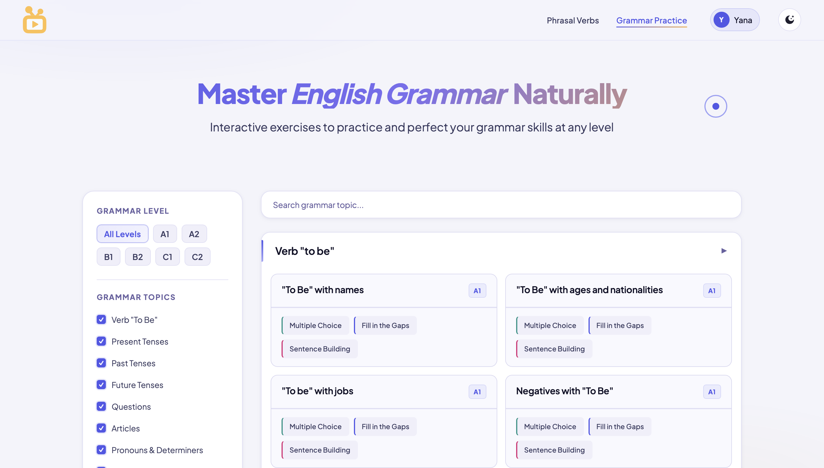
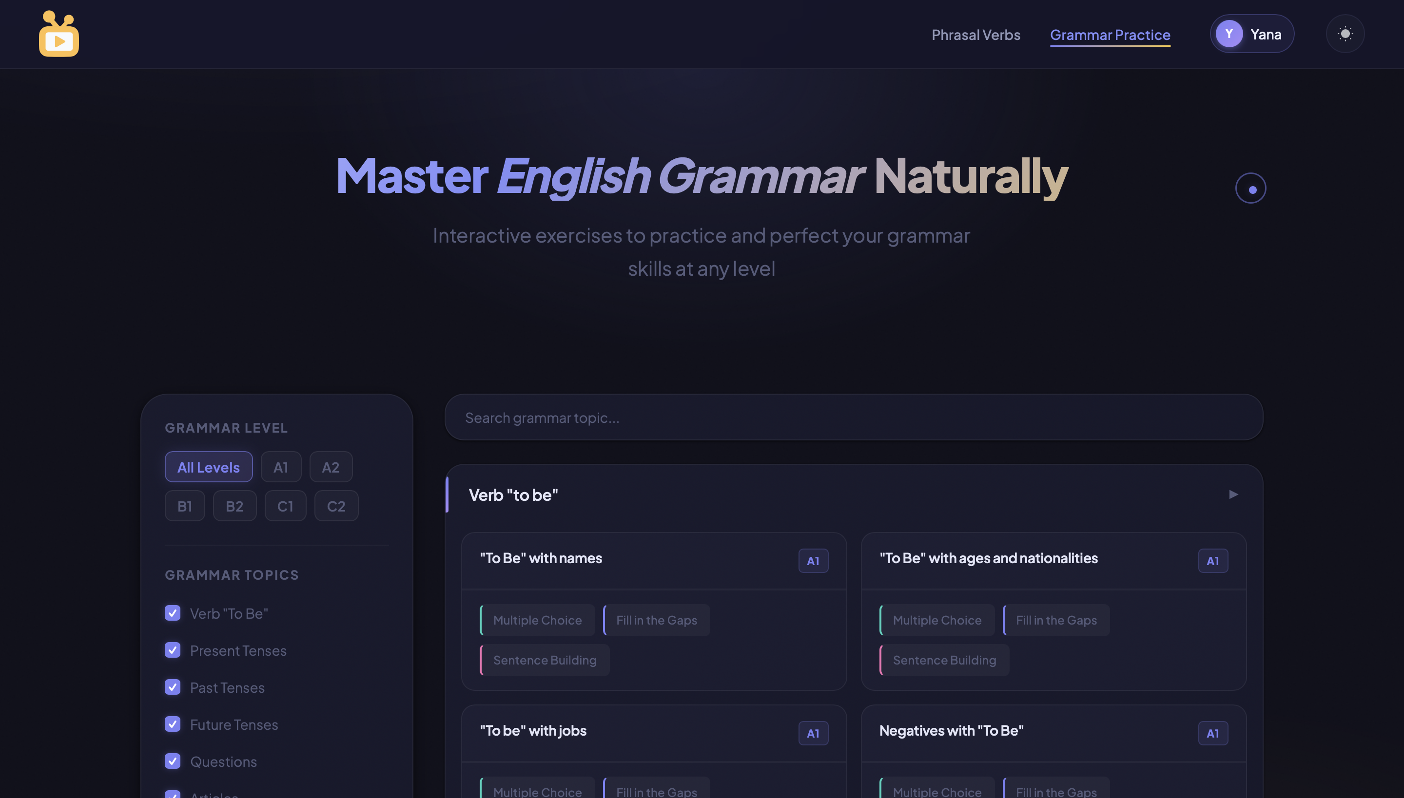
Grammar Practice
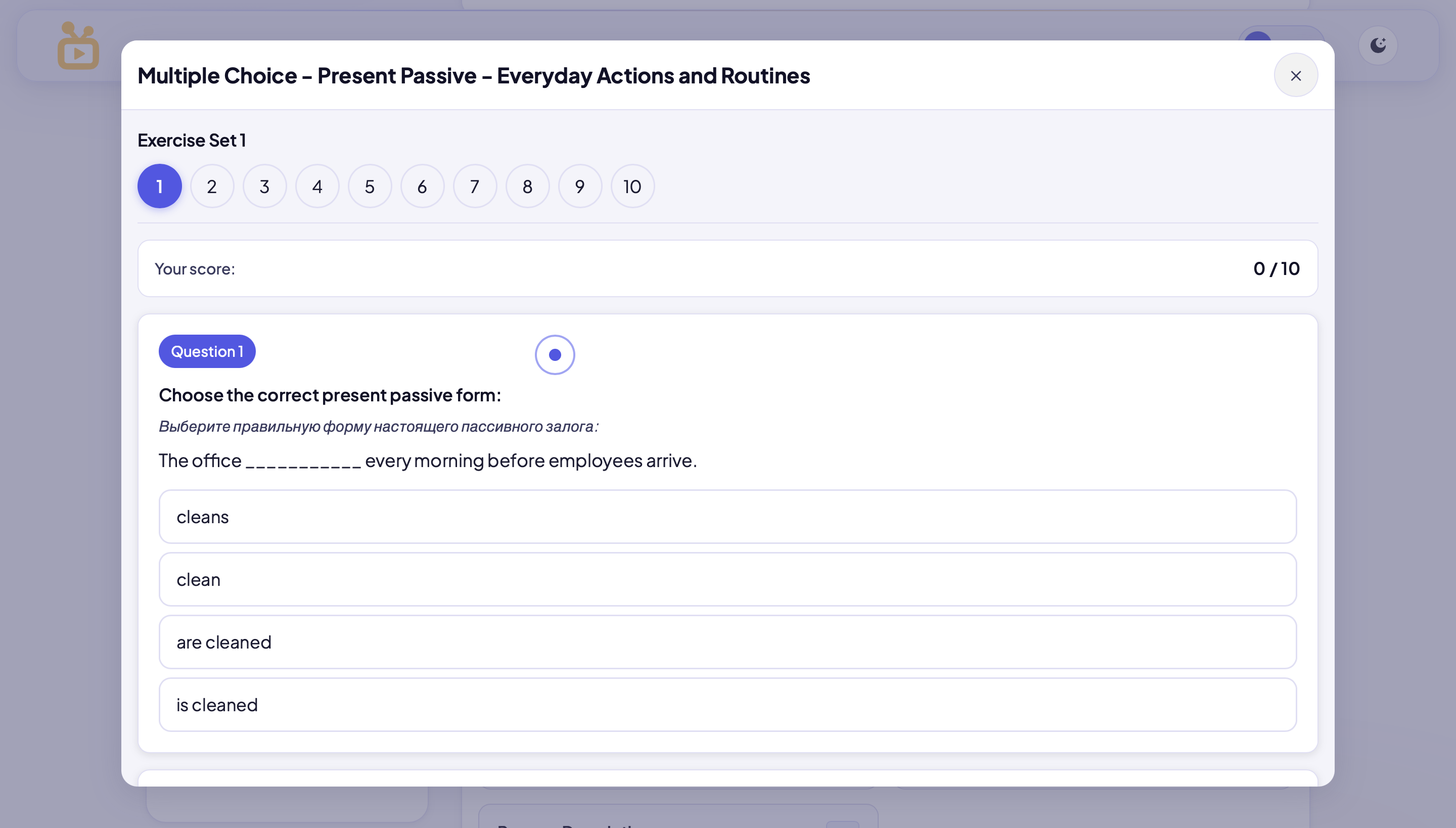
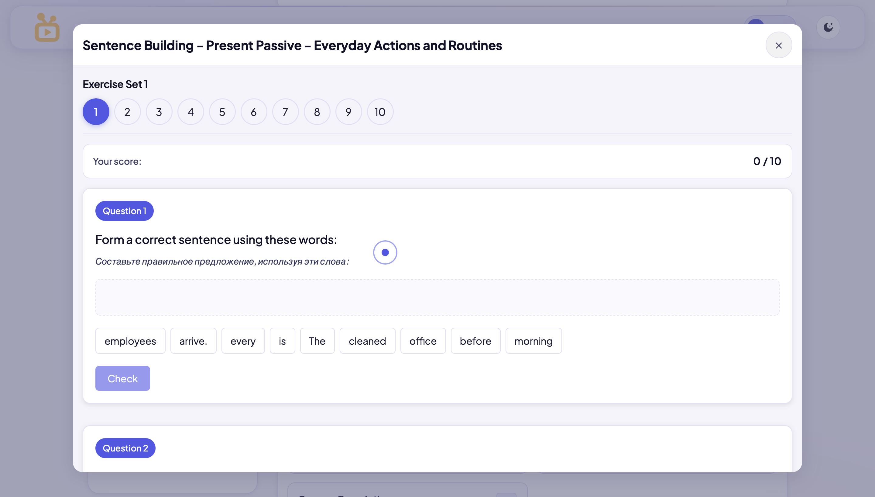
Exercise Modal
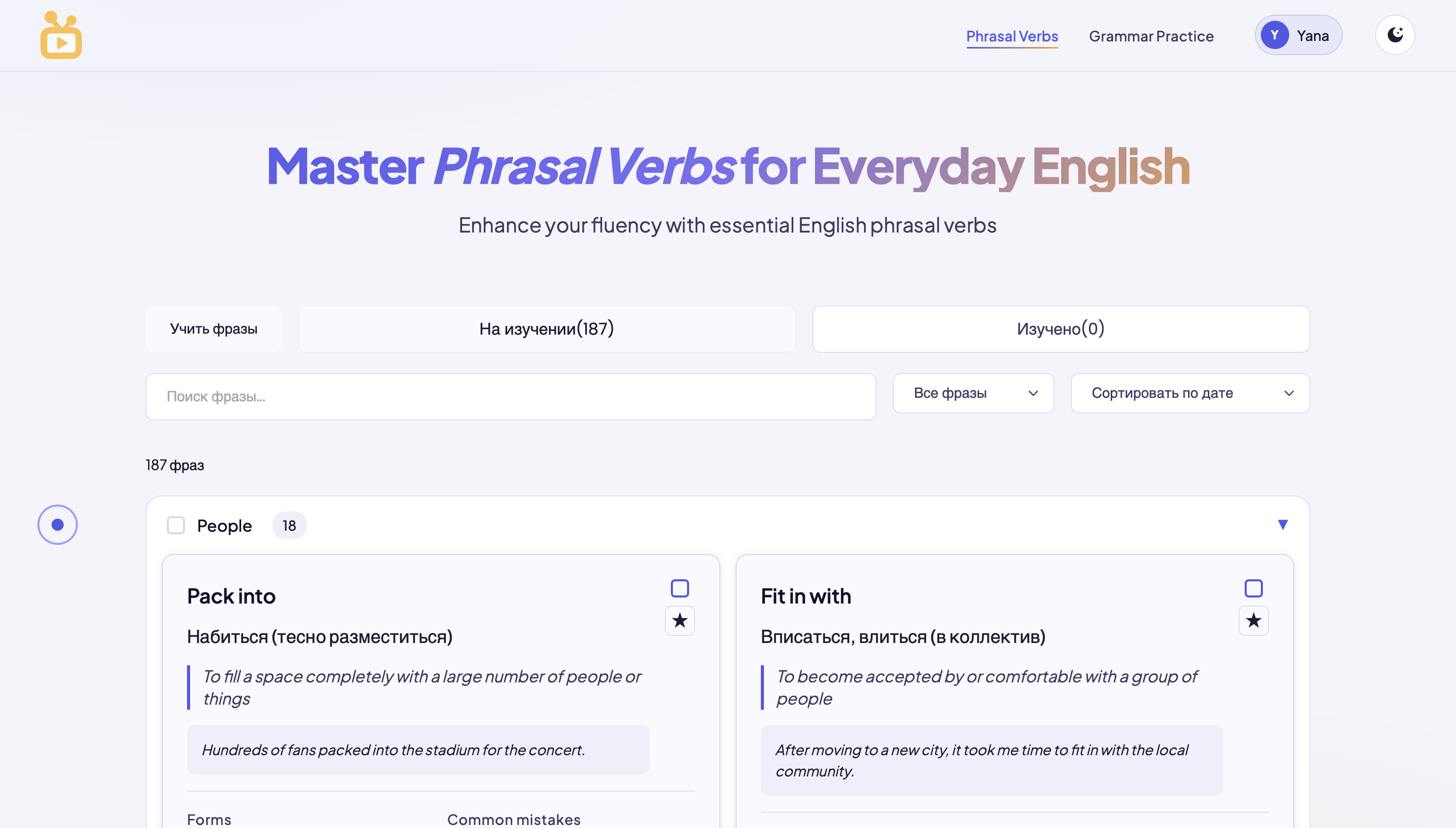
Phrasal Verbs
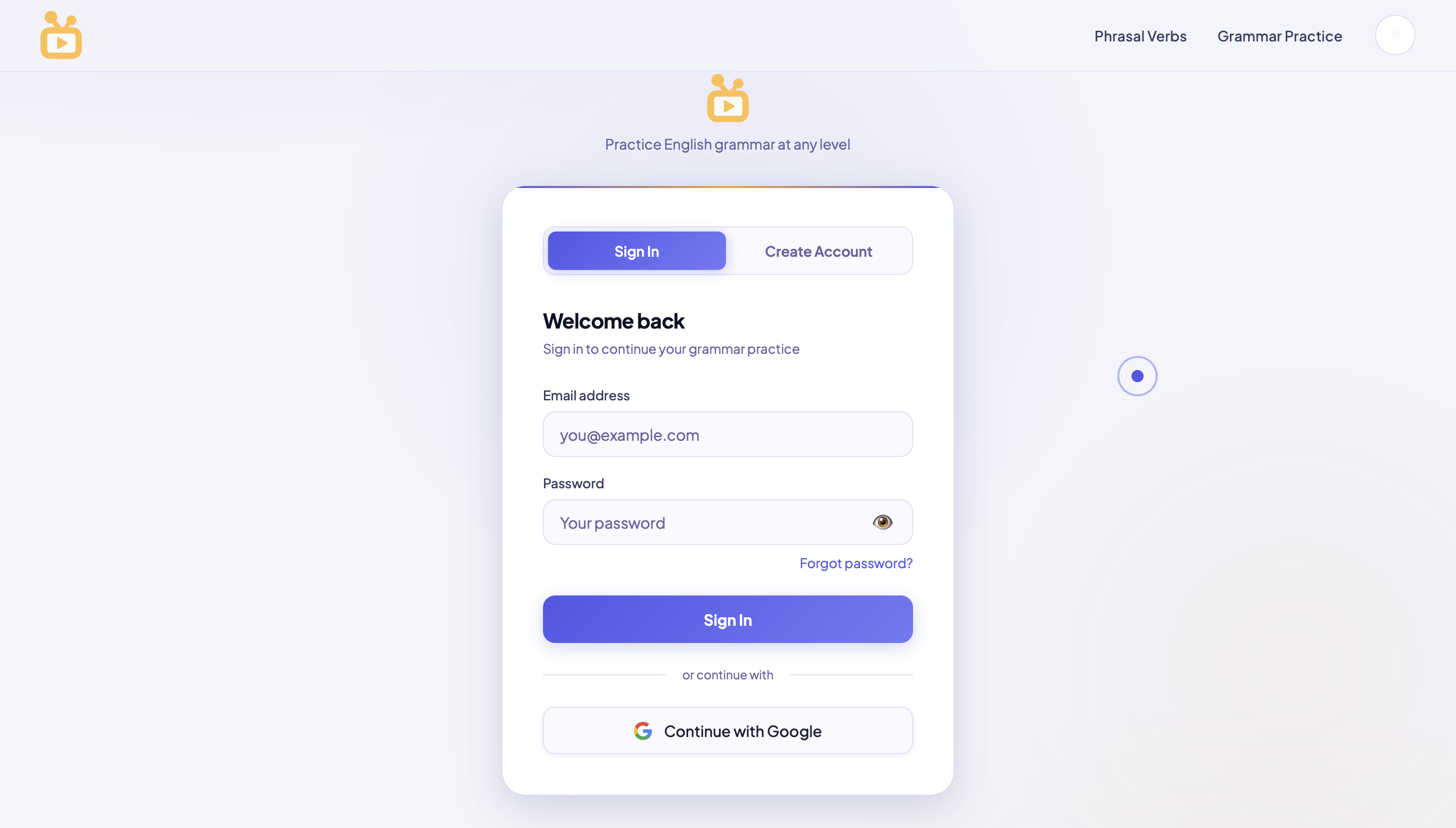
Auth Flow
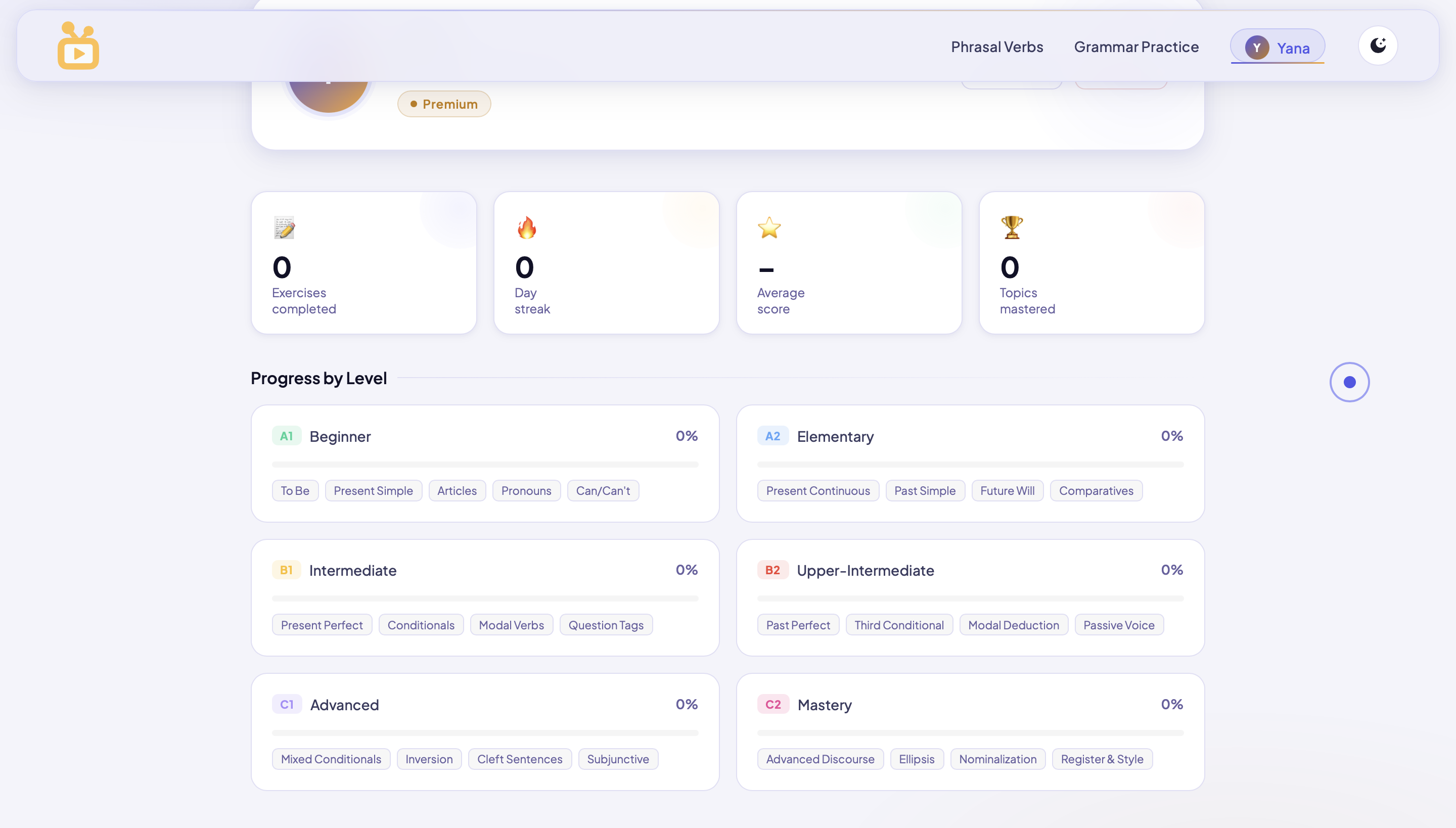
Dashboard & Progress