Case Study · 2024

Caixadirecta
Redesign

A full UX process redesign of Portugal's leading banking application — from research and personas through to clickable prototype. Making banking feel intuitive for every generation.

Role
UX/UI Designer
Platform
iOS / Android
Year
2024
Caixadirecta home screen
Client
Caixa Geral de Depósitos
Deliverables
Research · Personas · CJM · Wireframes · UI · Prototype
Themes
Light & Dark

"Banking made simpler and more efficient."

01 — The Brief

Challenge &
Goals

The Caixadirecta app is used by millions of Portuguese citizens — but its outdated design was failing them. A full redesign to bridge the gap between a trusted institution and modern expectations.

The Challenge

An outdated experience for a modern world

The existing app suffered from a cluttered interface, poor navigation hierarchy, and accessibility gaps that made simple tasks unnecessarily complex — especially for older users.

Confusing navigation with no clear information hierarchy
Outdated visual language — failed to communicate trust and modernity
No chat or in-app support — users forced to call or visit branches
Poor accessibility for elderly users unfamiliar with digital banking
Goals

Three clear outcomes to aim for

Through modernising the design, simplifying navigation, improving accessibility, and enhancing security, the redesign aimed at increasing user engagement and satisfaction.

Simplify navigation and increase app usability for all user groups
Revise the layout to conform to modern design standards while preserving trust
Boost dependability and security without sacrificing ease of use
01 — Process

Design Process

From discovery to prototype — every phase grounded in evidence, not assumption

01
Competitor
Analysis
Market researchActivoBank · Millennium · Santander
02
Surveys &
Reviews
User voicesApp Store reviews · Real user surveys
03
Personas
& CJM
3 personasMaria · João · Ana · full journey maps
04
UI
Design
30+ screensLight & Dark · iOS HIG · UI Kit · Prototype
05
Analytics
& Edits
IterationTests · feedback loop
Role: UX/UI Designer (Solo)
Platform: iOS & Android
Year: 2024
Screens: 30+
Themes: Light & Dark
02 — Research

Competitor
Analysis

I analysed three leading Portuguese banking apps to understand market standards, identify best practices, and find opportunities for differentiation.

ActivoBank
Modern, clean UI with strong digital-first positioning. Excellent onboarding, clear transaction flow. Benchmark for youthful aesthetic and streamlined experience.
Millennium bcp
Feature-rich with robust security flows. Strong business banking tools. Navigation complex but information dense — trusted by power users who need depth.
Santander
International design standards, consistent visual system. Clear hierarchy and accessible typography — strong accessibility benchmark across all age groups.

"All three competitors offered better accessibility and clearer navigation than Caixadirecta — confirming the opportunity to leapfrog with a truly user-centred redesign."

03 — User Research

App Store
Reviews

In order to identify the typical problems Caixadirecta consumers encounter, I conducted a survey among its users and analysed real user evaluations from the App Store.

Caixadirecta App Store reviews
These are real App Store reviews from existing Caixadirecta users — not invented. They directly informed the persona development and design priorities in the next phase.
04 — Personas

Prototype
Personas

Upon evaluating the reviews, I developed three prototype personas representing the full spectrum of Caixadirecta users.

Maria
Maria
25 · Junior Marketing Specialist
PersonalityTech-savvy, active, and social
OccupationJunior Marketing Specialist
LifestyleBusy schedule, uses phone for all banking tasks, values efficiency
Frustrations
Difficulty navigating to frequently used features like transfers and bill payments
Outdated design that feels clunky and not visually appealing
Lack of quick access to transaction history
Goals
Effortlessly manage day-to-day banking activities
Quickly access financial information and transaction history
Use a modern, aesthetically pleasing app
João
João
40 · Small Business Owner
PersonalityPragmatic, detail-oriented
OccupationSmall Business Owner
LifestyleConstantly on the go, prefers tools that save time, values security
Frustrations
Complex navigation and hidden features increase time on banking tasks
Lack of business-specific features like expense tracking
Security concerns with the current authentication methods
Goals
Manage business finances efficiently and securely
Access detailed transaction records and expense reports
Have a reliable app that supports business banking needs
Ana
Ana
65 · Retired Teacher
PersonalityCautious, prefers simplicity
OccupationRetired Teacher
LifestyleFamily-oriented, uses technology primarily to stay connected and for essential tasks
Frustrations
Finds the current app overwhelming and difficult to navigate
Struggles with understanding banking terminologies used
Concerned about the security of online banking
Goals
Perform basic tasks like checking balances and transferring money easily
Have clear, simple instructions and a straightforward interface
Feel confident and secure using the app for banking
05 — Journey Mapping

Customer
Journey Map

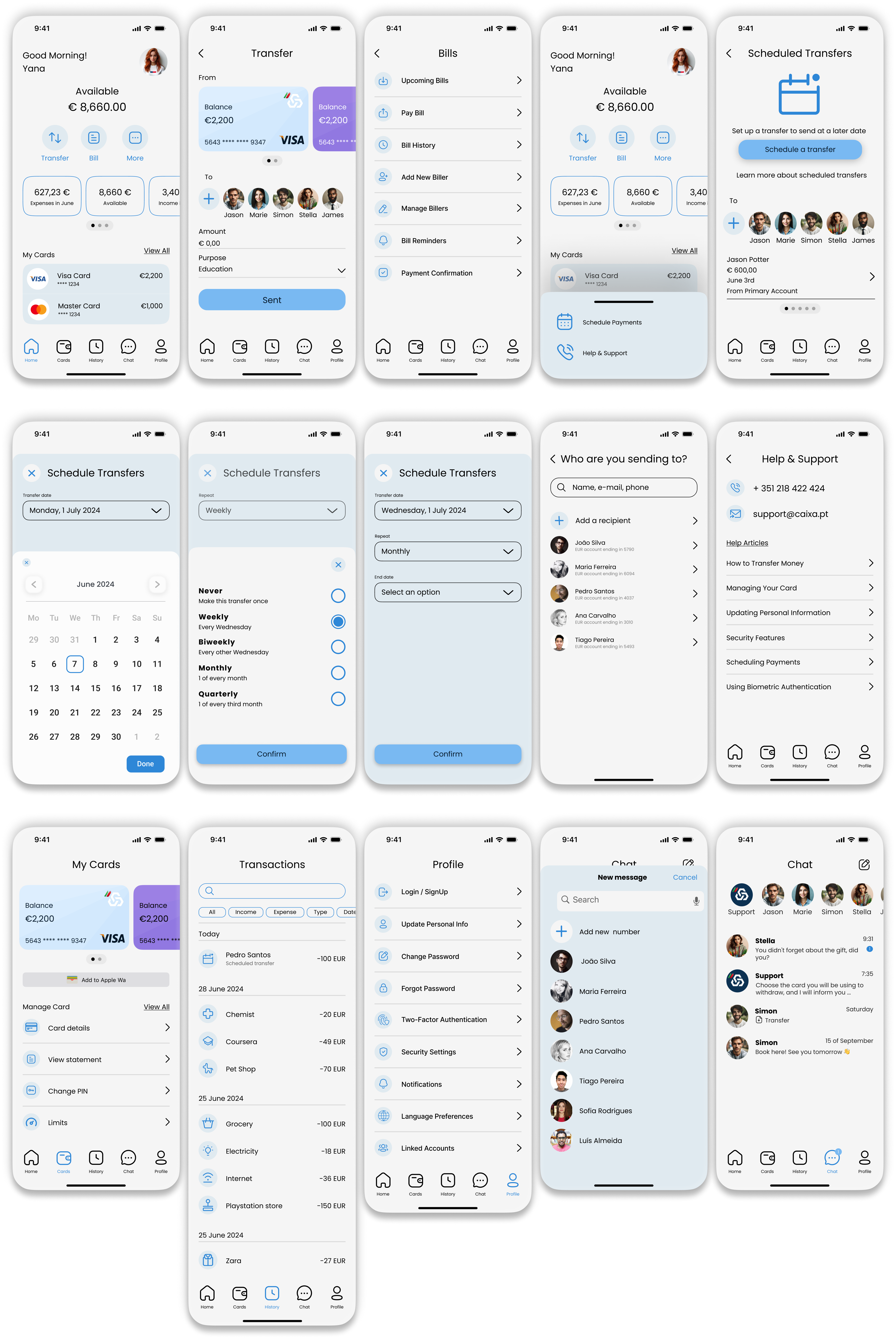
Mapping the full experience of all three personas across ten stages revealed consistent pain points and clear opportunities for the redesign.

M
Maria 25 · Marketing
J
João 40 · Business Owner
A
Ana 65 · Retired Teacher
Discovery
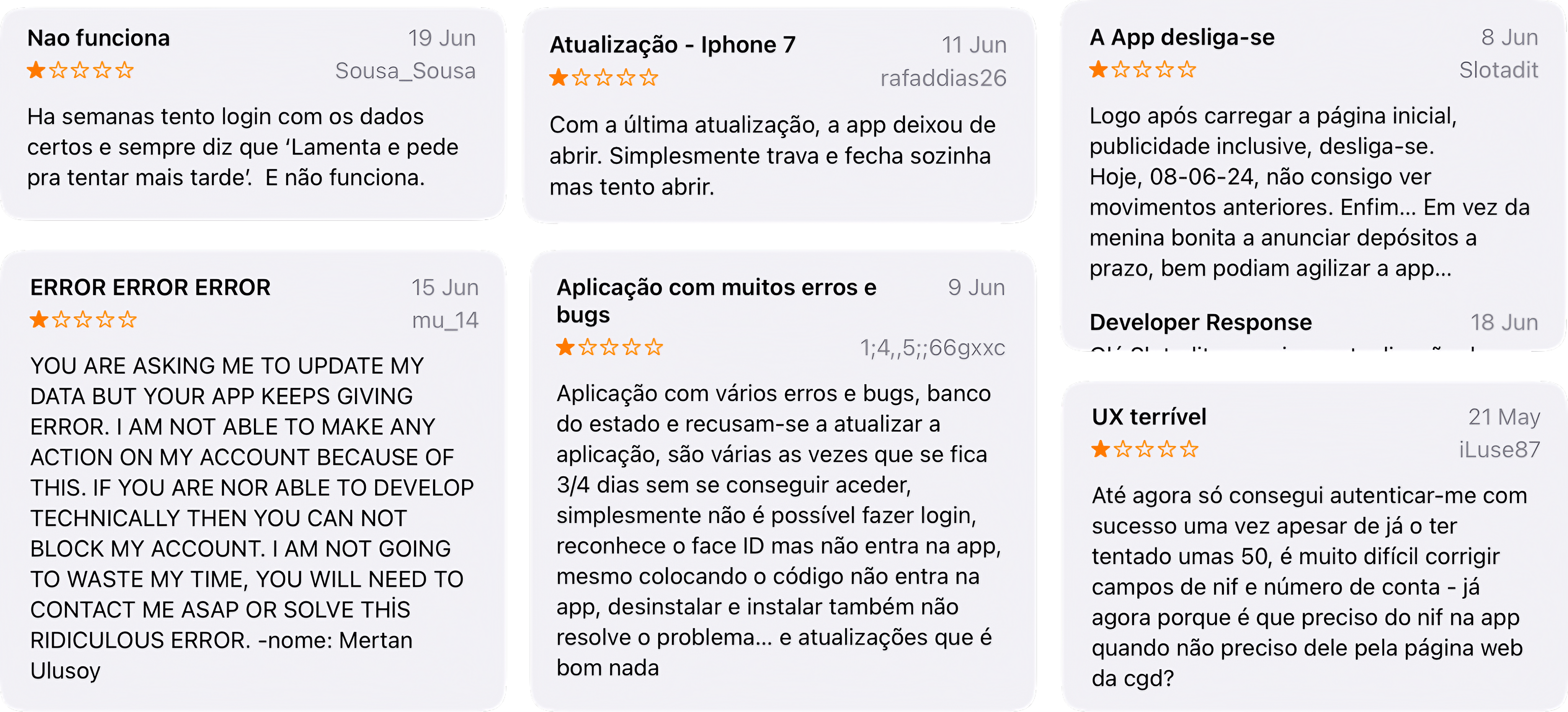
Outdated design and difficult navigation made the app feel untrustworthy
Complex navigation and hidden security settings caused frustration
Overwhelming interface and unfamiliar banking terminology
Emotions & Thoughts
Frustration, hope for something better
Frustration, relief only when security works
Confusion, actively seeking simplicity
Touchpoints
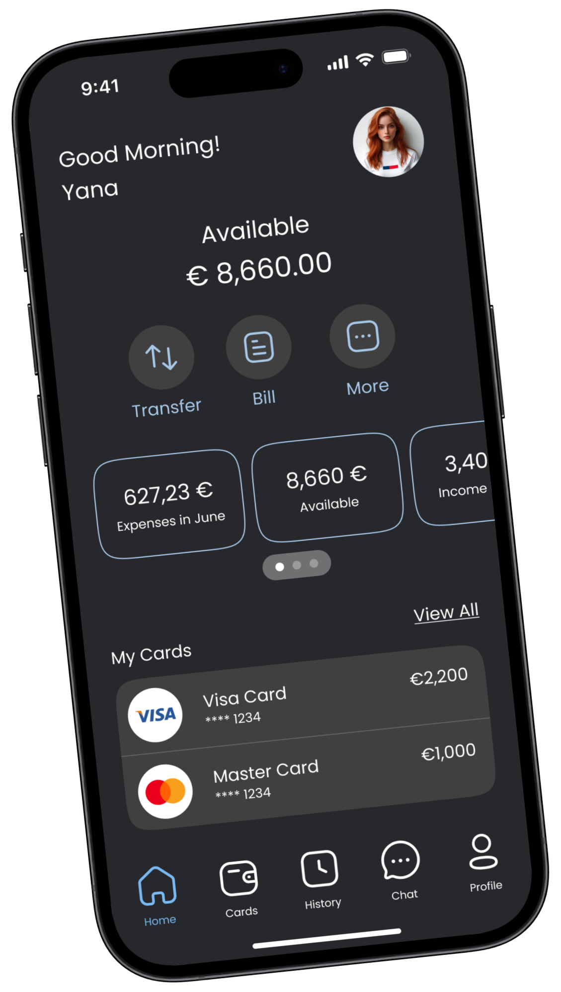
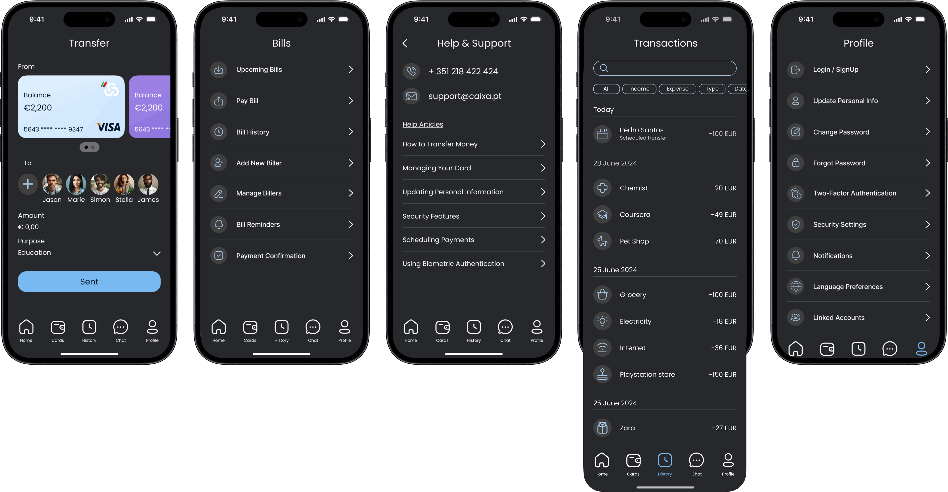
Homepage, navigation menu, quick actions
Security settings, transaction history, business tools
Dashboard, help section, balance view
Pain Points
Cluttered interface, no quick access to history
Hidden features, complex authentication flow
Unclear instructions, scary error messages
Opportunities
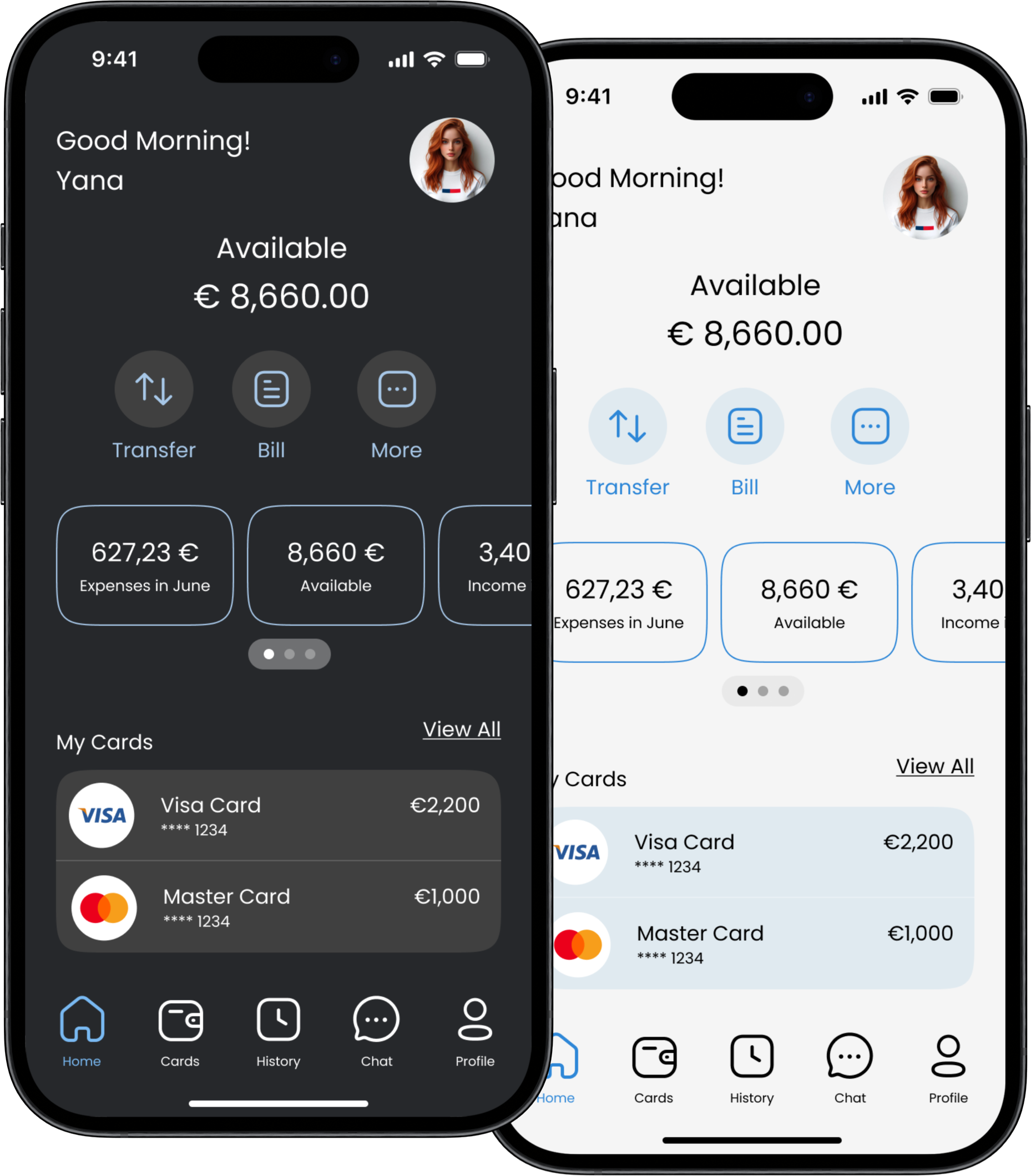
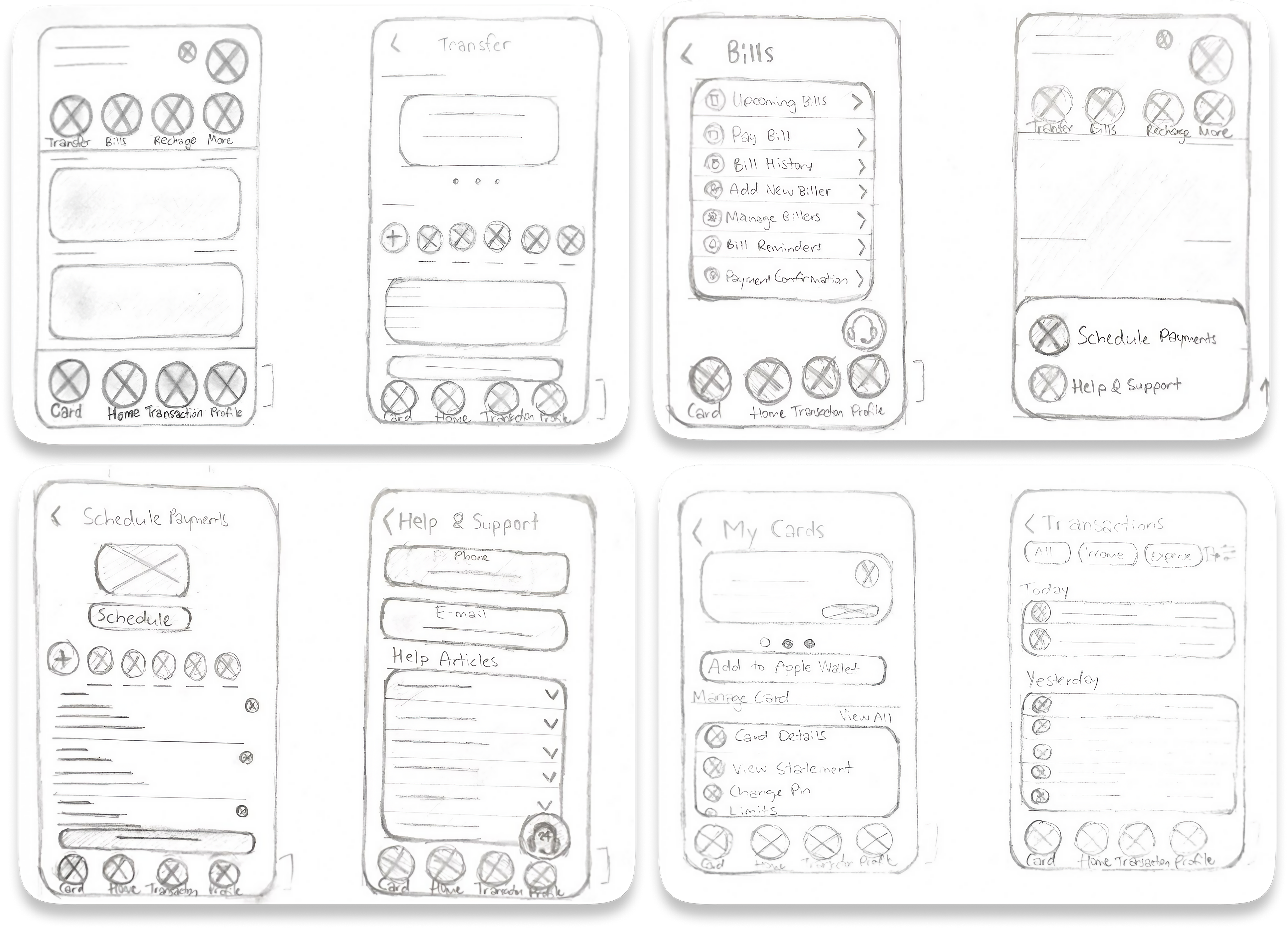
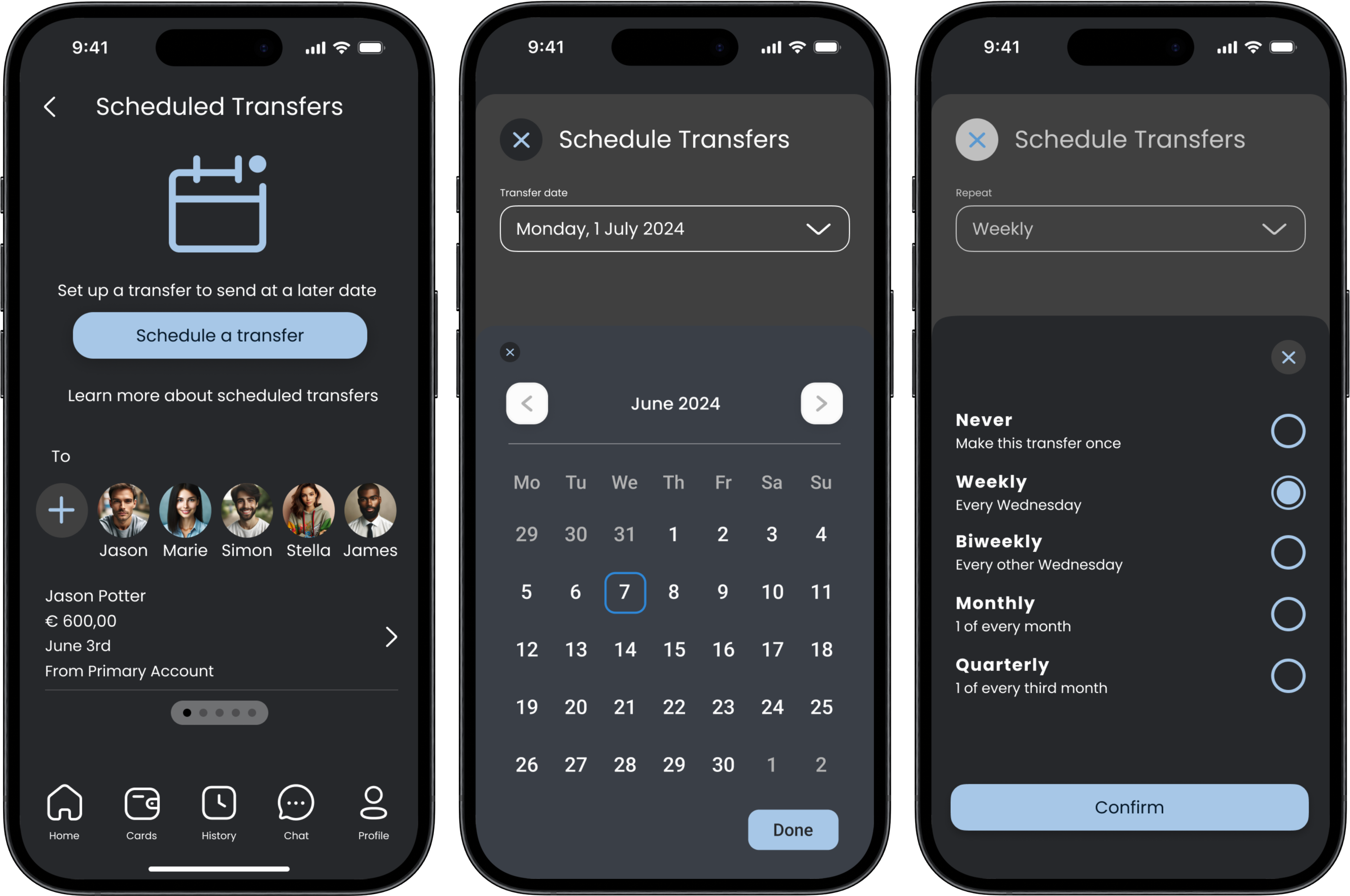
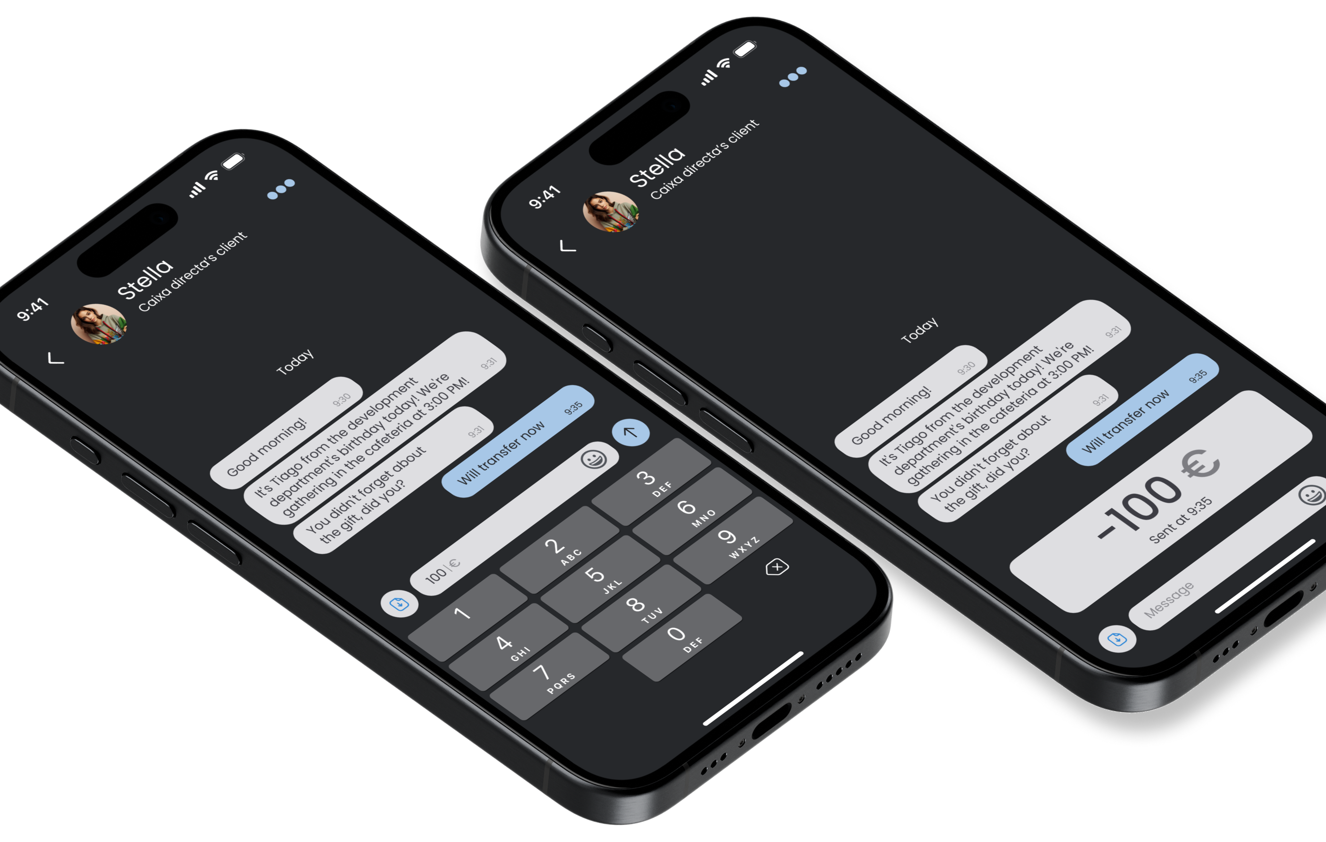
Simplified navigation, clearer labels, quick shortcuts
Streamlined authentication, intuitive business tools
Plain language, guided walkthroughs, bigger tap targets
Improvement Ideas
Enhanced transaction categorisation, home shortcuts
Advanced reporting, seamless business integrations
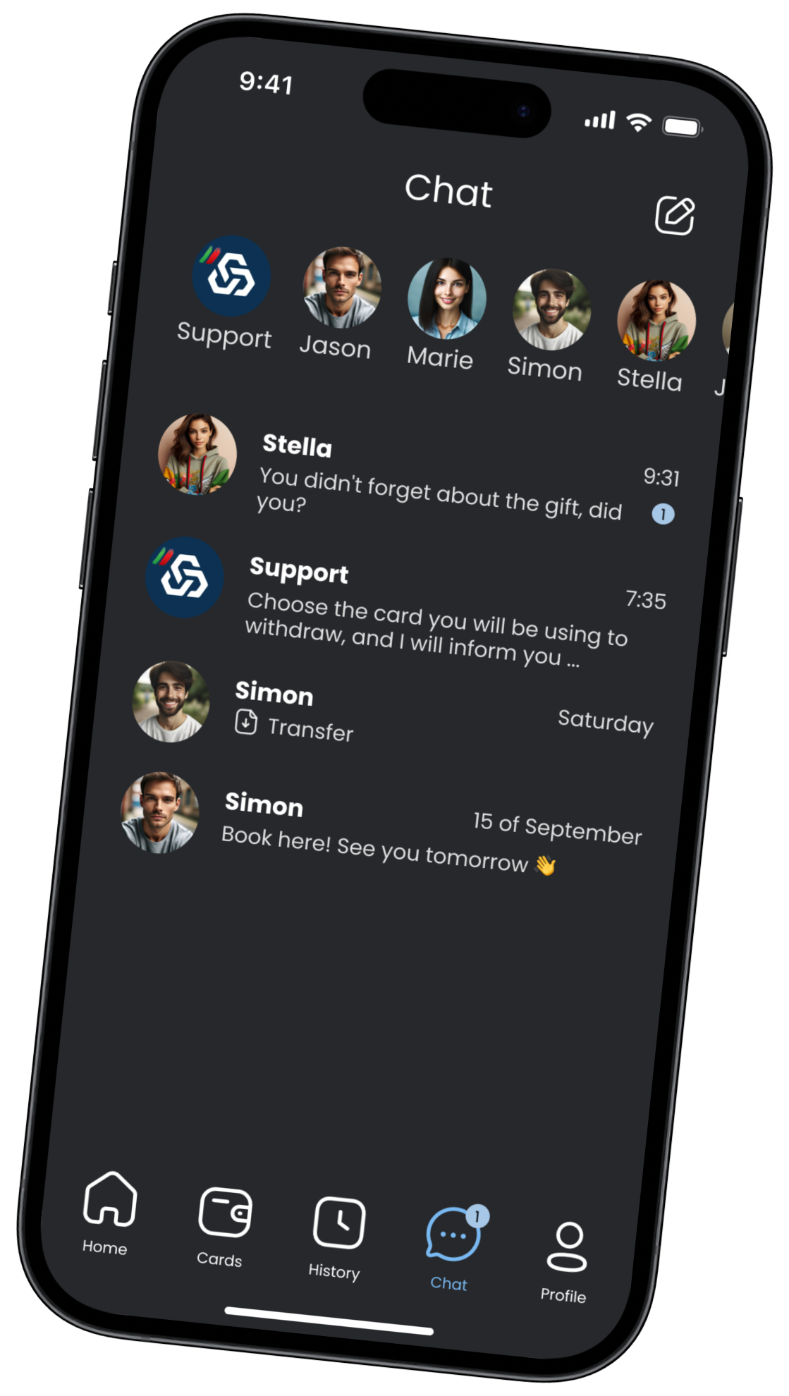
Enhanced customer support, intuitive help resources
Device / Environment
Mobile-first, always on the go
Mobile + occasional desktop, on-the-go management
Mobile only, family-oriented, at home
Competitive Analysis
Compare with apps offering sleek design and easy navigation
Benchmark against apps with robust security and business tools
Evaluate against user-friendly apps with clear instructions
Business Goals
Improve efficiency and user satisfaction
Enhance security and business functionality
Provide simple and reliable banking experience
Feedback Loop
Regular surveys, user feedback forums
Business user focus groups
Community polls, customer satisfaction surveys
06 — Ideation

Sketches &
Wireframes

Caixadirecta sketches

From idea to layout, fast

Hand-drawn sketches were essential for quickly exploring layout ideas and testing assumptions before committing to high-fidelity work. Each sketch represented a different approach to solving a user pain point.

"Sketching revealed that the transfer flow needed to be collapsed from 5 steps to 3 — the original was unnecessarily complex."
"A bottom navigation bar emerged as the clear solution for accessibility — especially for Ana's one-handed usage pattern."
Caixadirecta three screens
Home Screen

07 — Home Screen

Everything at a glance

Caixadirecta: All-in-One Banking Hub

The redesigned Home Screen puts everything users need at their fingertips — from quick actions to account overview, all accessible in seconds.

Quick Actions
Transfer, pay bills, top up — all accessible with a single tap.
Finances at a Glance
Balances, recent transactions and cards — all visible on one screen.
Instant Support
New Chat feature — get help and send money without leaving the app.
Chat Screen

08 — Chat Screen

Support built right in

Banking Made Easy: Chat at Your Fingertips

Traditional banking support means waiting on hold or visiting a branch. The new Chat feature eliminates both — real-time help and money transfers, all in conversation.

Real-time Support
Connect with agents instantly — no hold music, no branch visits.
Send Money in Chat
Transfer to friends and family directly from the conversation.
Chat across themes
User-Centric Redesign

09 — Design System

User-centred, top to bottom

Quick Access · Clear Actions · Effortless Management

The revised design puts user experience first with improved comfort, functionality, and button clarity. Every interaction was redesigned with purpose.

Accessible Tap Targets
All interactive elements meet WCAG AA touch target requirements — 44×44pt minimum.
Clear Visual Hierarchy
Self-explanatory icons and large transaction amounts reduce cognitive load for all users.
10 — Visual Identity

Light &
Dark Theme

The new design features both light and dark themes, incorporating the bank's signature colours for a sleek, modern, and cohesive look across every context.

Light and Dark Themes
11 — Information Architecture

App
Site Map

The app's information architecture was completely redesigned around task frequency — the most common actions accessible in one tap from anywhere via the bottom navigation bar.

Welcome Screen Home Screen NAVIGATION (FOOTER MENU) Transfer Bills More Card Screen History Chat Profile Scheduled Payments Payment Confirmation Upcoming Bills / Pay Bill Bill History / Reminders Add New Biller / Manage Billers Bill Reminders / Confirmation Help & Support / Help Articles Contact phone & email In-app Chat Support In-app Chat Support Card Details / Change PIN Block Card / Request Payment Confirmation Transaction History Transaction Detail View Chat with Support New Message / Send Money In-chat Money Transfer Login / Signup / Update Info Security / Notifications Change Password / Linked Accounts Entry / Key screen Nav tab Feature page Sub-feature Optional / deeper flow Cross-screen link

Outcome

A complete redesign. From research to prototype.

This project demonstrates how rigorous UX methodology — competitor research, user surveys, personas, journey mapping, sketches and iterative design — results in an experience that works for every generation of user.

3×
User Groups Researched
8
Process Stages
2
Complete Themes
30+
Screens Designed