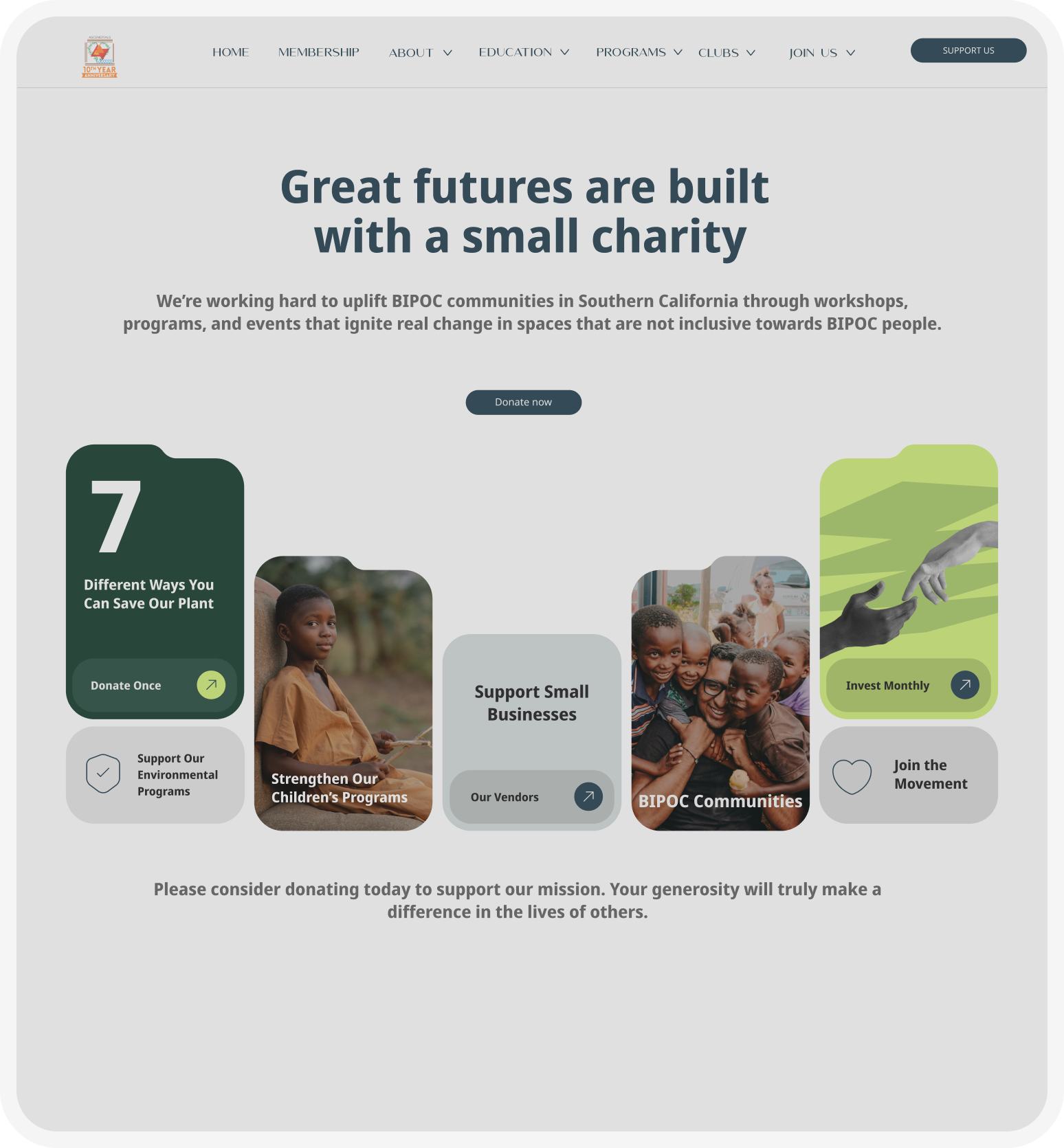
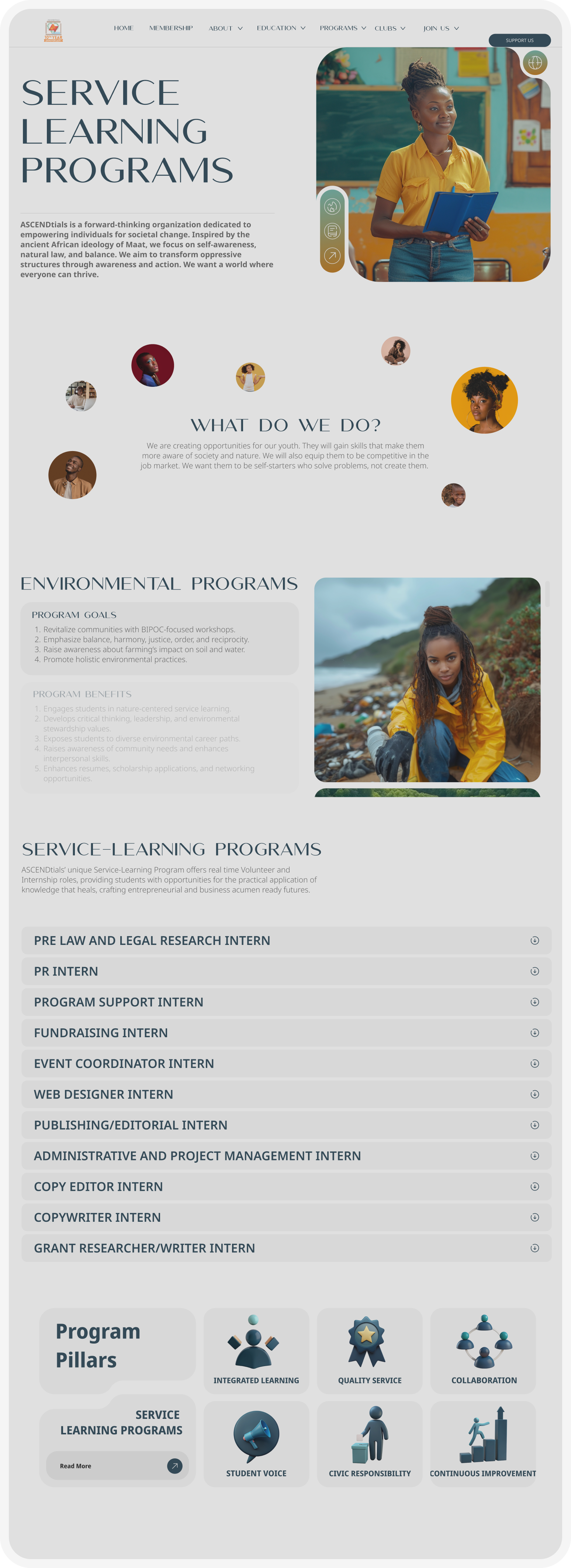
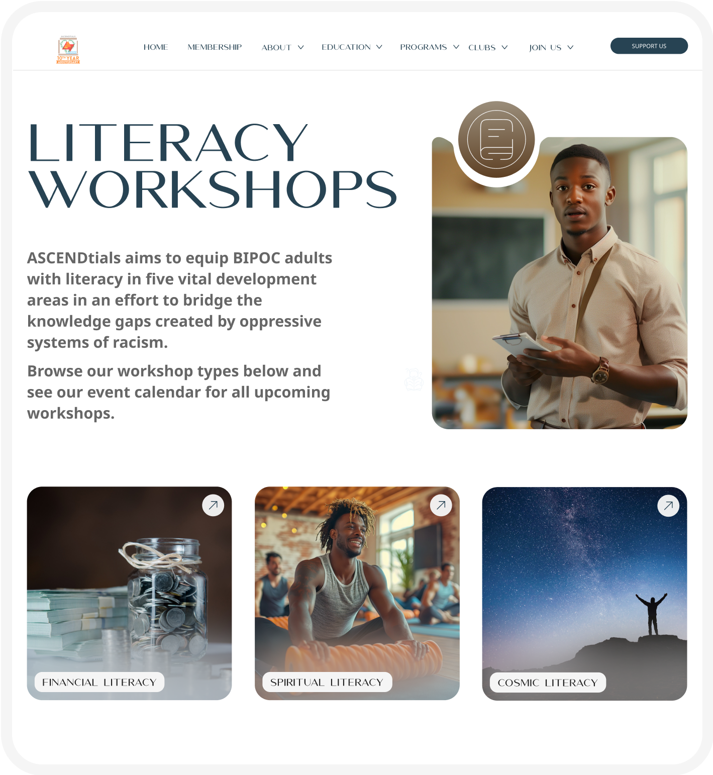
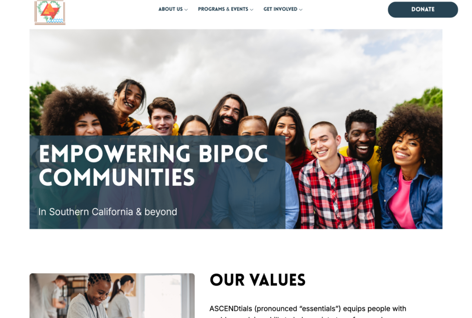
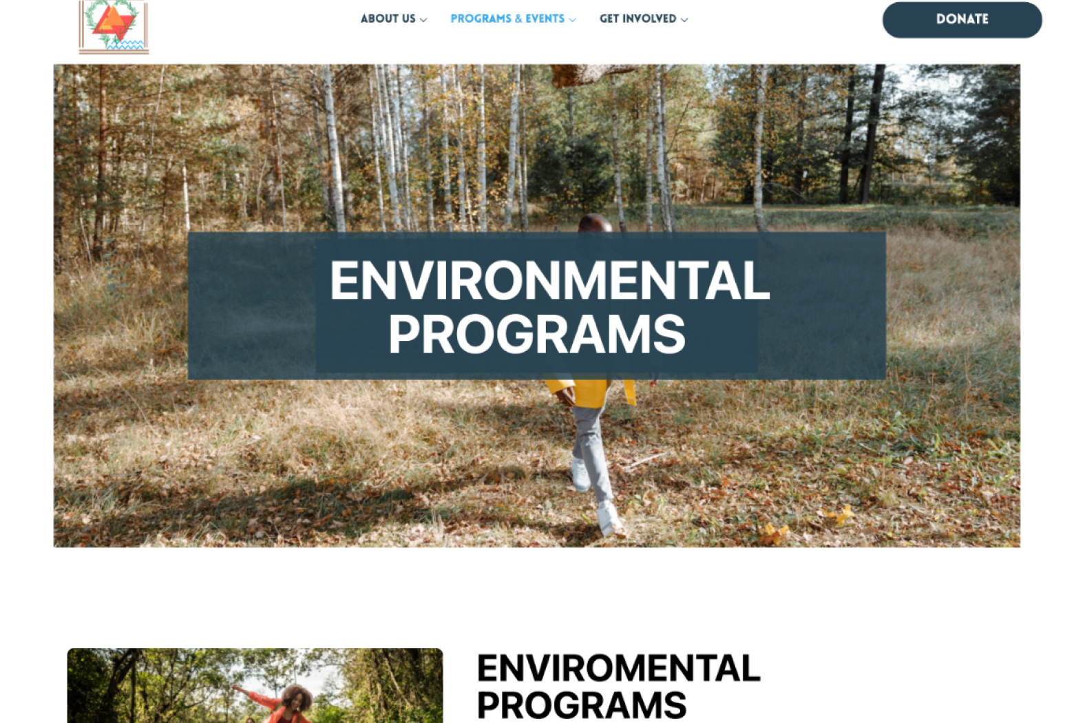
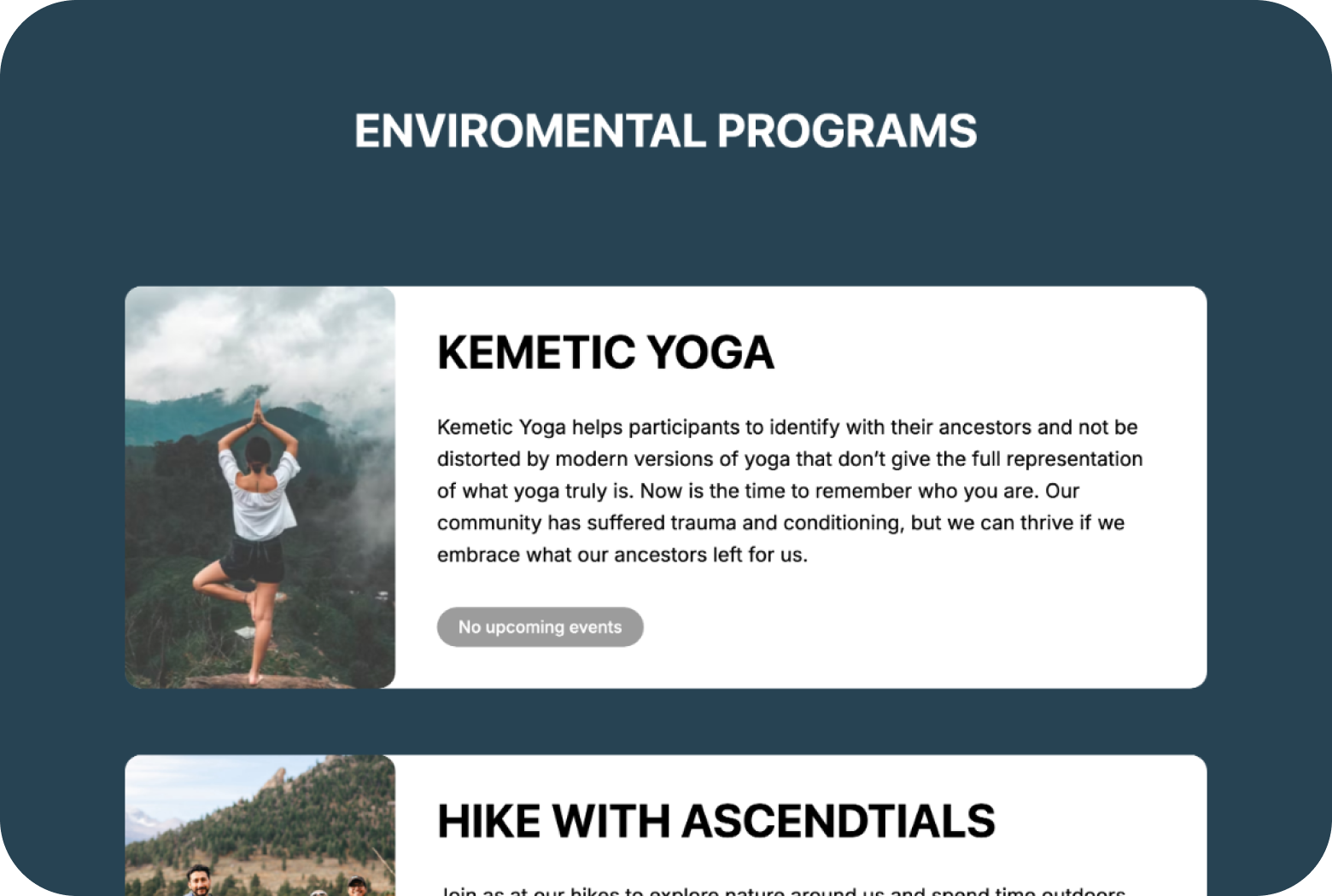
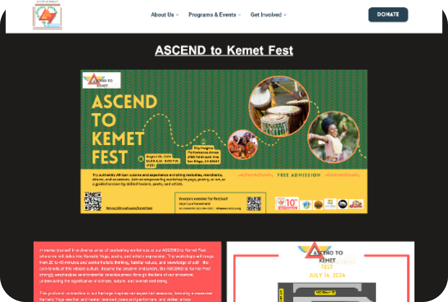
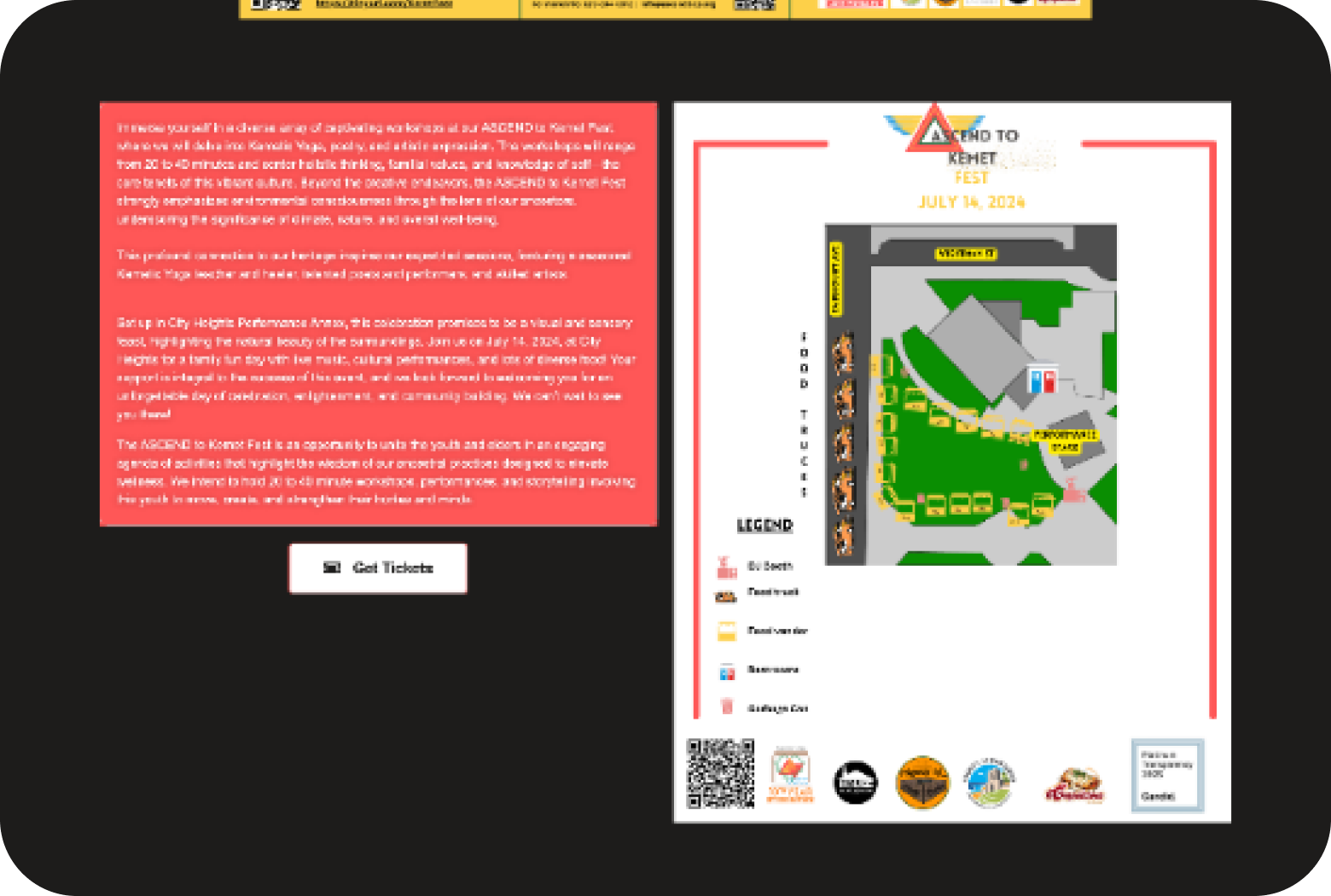
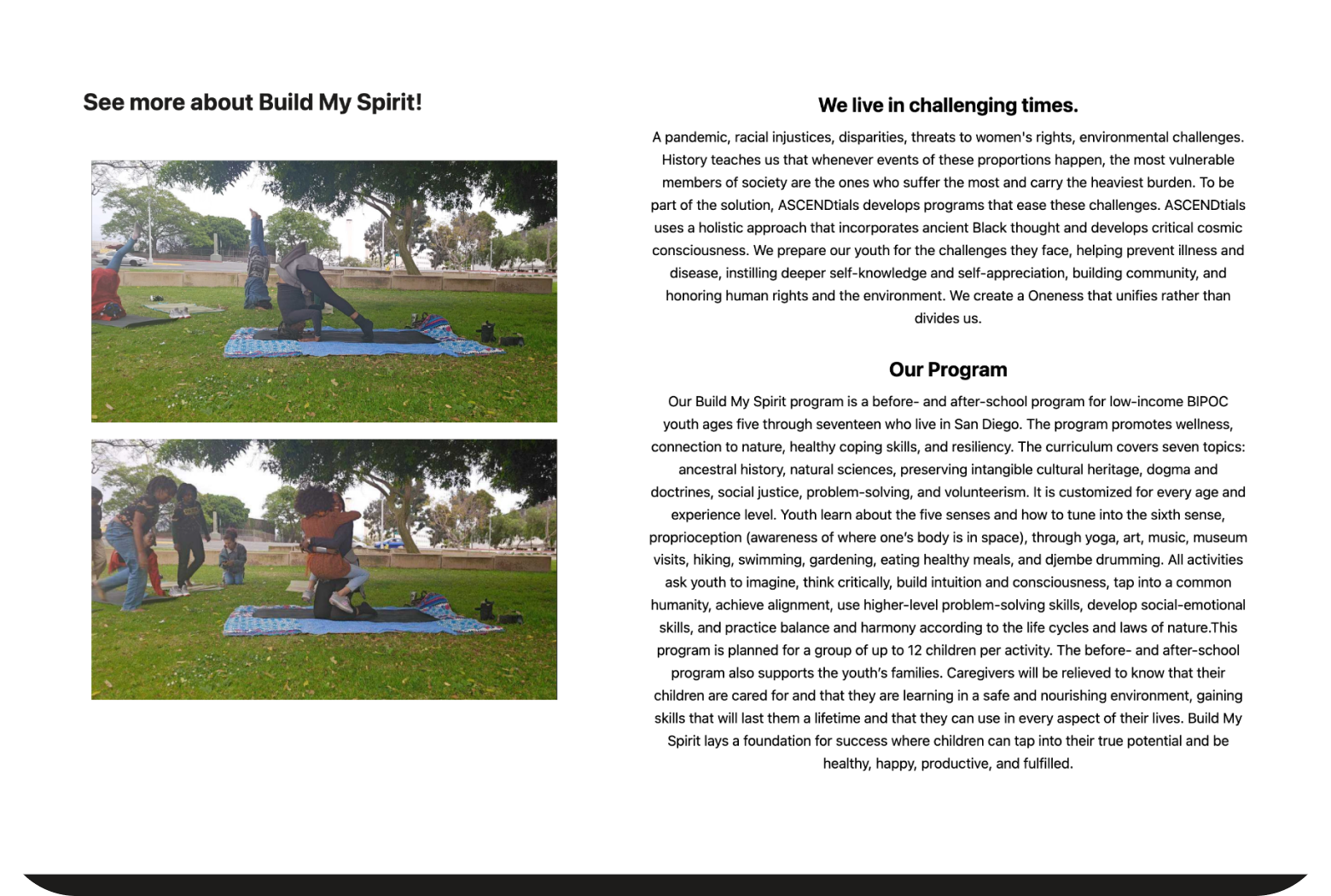
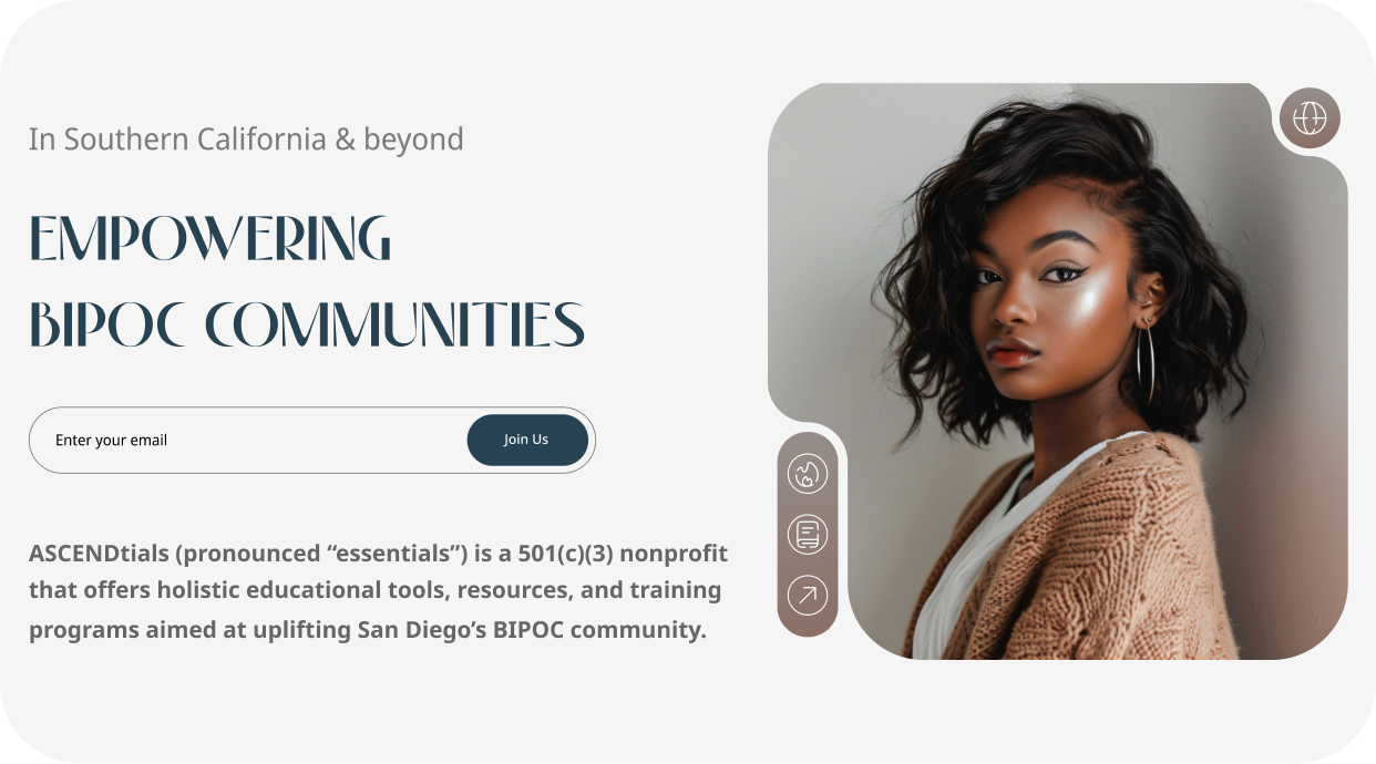
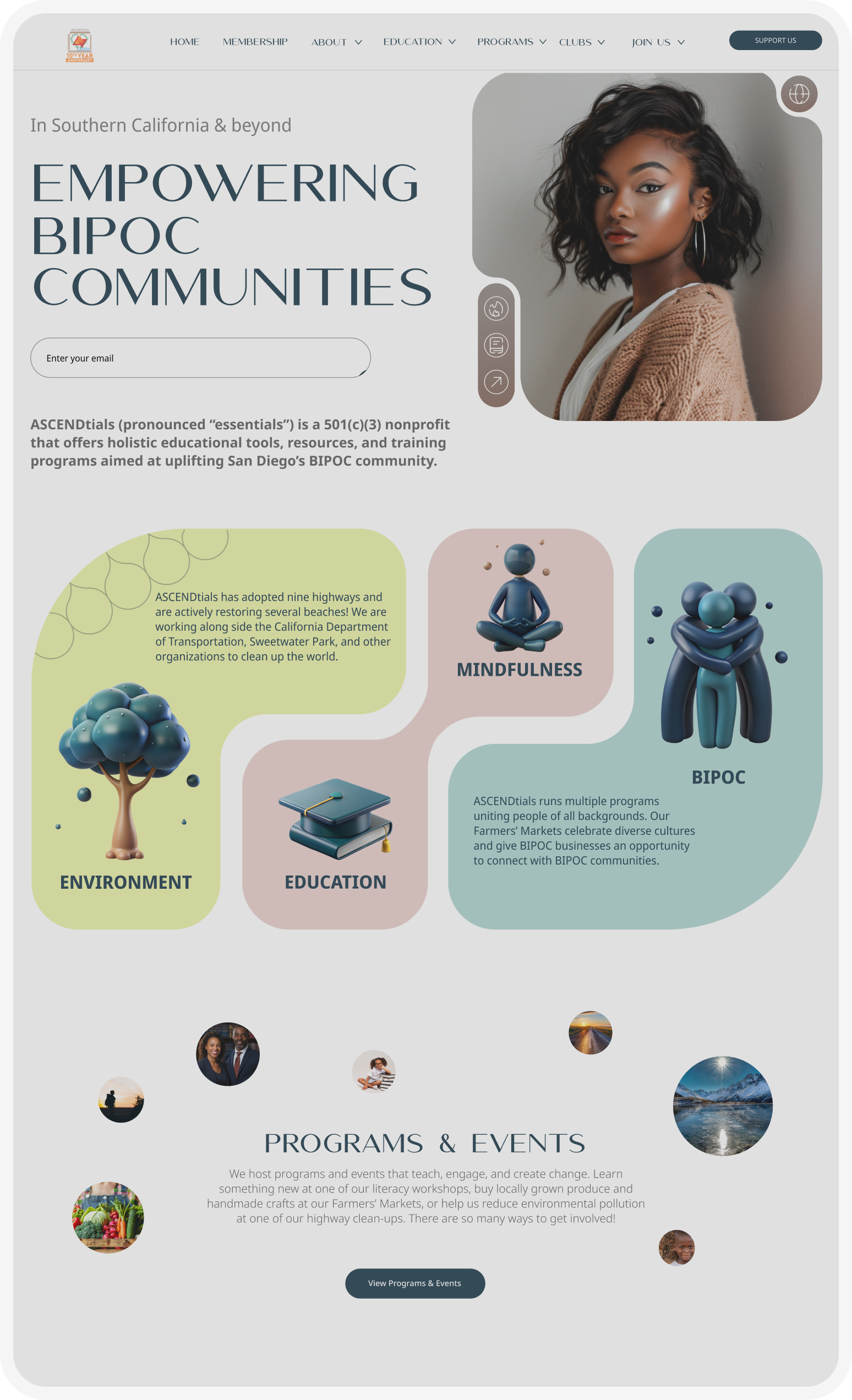
Hero Image

Complete Redesign for ASCENDtials

This project details the comprehensive redesign of ASCENDtials’ online platform, aimed at transforming a previously cluttered and outdated user experience into a visually engaging, accessible, and mobile-responsive interface. After conducting a UX audit to address design and usability flaws, I developed a modern, clean design approach, balancing the brand’s unique identity with streamlined user interaction. By coding and implementing new layouts, animations, and interactive elements, the redesign led to enhanced user engagement, increased subscriptions, and established ASCENDtials as a distinctive presence within its niche.

Project Information

The Challenge

My task was to continue working on the design of ASCENDtials' website, maintaining its original style, but with a focus on improving the user experience. The company insisted on keeping the heavy and cumbersome design style, despite its overwhelming feeling for users. At the same time, I had to conduct testing to identify and address key issues. The goal was to make the website more user-friendly, without losing the core elements of the brand identity.

Initial State

When I joined, the design of the website was bulky and overcomplicated. Here were the main issues I identified:

  • Lack of proper design principles, especially in typography.
  • Problems with navigation and content accessibility.
  • The design faced issues: cluttered visuals distracted from key information, excessive on-page content slowed decision-making, and interactive elements were inconsistently placed, making navigation difficult. This created a confusing user experience.
  • Excessive text overload, which complicated user experience.

Stages of Work

Project Goal and Task Analysis

Defining the company’s objectives and desires for improved UX and style consistency to strengthen ASCENDtials' unique image.

Market and Competitor Analysis

Researching market trends and competitor designs for accurate positioning.

Current State Assessment

Reviewing the existing website design and identifying issues with navigation, text, and outdated elements.

Color Palette and Visual Style

Developing a light color palette that reflects the company’s positive and community-oriented focus.

Creating Unique Shapes

Developing unique shapes for hero sections that reflect the company's identity and bring a modern touch.

Wireframe Development

Creating a low-fidelity wireframe for client approval and structural clarity.

Font Selection and Style Development

Testing fonts to visualize the brand.

Designing and Creating Site Animations

Establishing a unique visual style and animations to highlight company initiatives.

Coding and Optimization

Writing code for pages and optimizing for mobile devices.

Visual Style and Structure Development

Creating Unique Shapes

For the hero sections, I developed unique shapes that embody the company's identity. These elements add lightness and a modern touch, visually connecting with ASCENDtials' values.

Wireframe Development

To align the site structure with the client, I created a low-fidelity wireframe. This layout clarified content placement and refined the project vision before implementation.

Wireframe 1 Wireframe 2 Wireframe 3
Wireframe 4 Wireframe 5

Font Selection

Font Selection

To create a visual style that reflects the unique and positive nature of ASCENDtials, I began by selecting fonts. My options included Aesthetic Romance, Grotesk, Amoret Sans, Harmony Embrace, Quantify, and Satoshi. After analysis and testing, I chose Amoret Sans. This font perfectly conveys the lightness and friendliness the company aims for, avoiding excessive formality and giving the site a modern, elegant look.

For the main body text, I considered Noto Sans, Roboto, Lato, and Inter before selecting Noto Sans for readability and harmony with Amoret Sans.

The Result

Amoret Sans for headings. This font captures the company's light, friendly identity, avoiding formality and adding modern elegance.

For the main text, I selected Noto Sans. It pairs well with Amoret Sans, creating a clean, readable style that balances hierarchy and reinforces an approachable feel across the site.

Result
Home Page
Arrow
Move your cursor to see interactive effect

Programs & Events

We host programs and events that teach, engage, and create change. Learn something new at one of our literacy workshops, buy locally grown produce and handmade crafts at our Farmers' Markets, or help us reduce environmental pollution at one of our highway clean-ups. There are so many ways to get involved!

View Programs & Events

I incorporated a parallax effect to add depth and visual interest to the page, making it more engaging for users.

Kemetic Yoga Page
Move your cursor to see interactive effect
Arrow
Previously, the text under the cards took up a lot of space, so I streamlined it and added interactivity—information now appears on hover.
Donation Page
Arrow
Move your cursor to see interactive effect
Different Ways You
Can Save
Our Planet
7
Donate Once
Support Our
Environmental
Programs
Strengthen Our
Children's Programs
Support Small Businesses
Our Vendors
BIPOC Communities
Invest Monthly
Join the
Movement

The Donation page stands out with its unique shapes, adding a fresh and memorable touch to the design.

The animation works on scrolling

Environmental Programs

Program Goals

  1. Revitalize communities with BIPOC-focused workshops.
  2. Emphasize balance, harmony, justice, order, and reciprocity.
  3. Raise awareness about farming's impact on soil and water.
  4. Promote holistic environmental practices.

Program Benefits

  1. Engages students in nature-centered service learning.
  2. Develops critical thinking, leadership, and environmental stewardship values.
  3. Exposes students to diverse environmental career paths.
  4. Raises awareness of community needs and enhances interpersonal skills.
  5. Enhances resumes, scholarship applications, and networking opportunities.
Environmental Program Image 1 Environmental Program Image 2
Arrow

On the Environmental Program page, text flows smoothly between cards, and images change dynamically—adding interactivity and drawing attention to the program.

Program Pillars
Arrow

In the Program Pillars section, I used unique shapes with icons to represent different service learning programs.

Service Learning Page

Other pages

About Us Page
Literacy Workshops Page Membership Page

From Design to Code

Implementation and Optimization

After completing the design, I moved on to development—coding each page to bring the design to life as a functional website. This included creating responsive and optimized versions, ensuring smooth performance on mobile devices.

From Design to Code

UI Kit

UI Kit
Thank You