A full website redesign for a licensed private kindergarten in Volgograd, Russia — transforming an outdated, cluttered site into a warm, premium, conversion-focused digital presence.
Smart Baby (Умный Малыш) is a licensed private kindergarten in Volgograd offering child development programs — mental arithmetic, school preparation, weekend groups, and more.
Their existing site at 34sadik.ru had grown into a chaotic patchwork of mismatched styles and zero design language. Parents landing on it were losing trust before reading a single word. The gap between their real-world quality and digital presence was doing commercial damage.
The goal: build a site that parents trust at first glance — warm, professional, and optimised for conversion.
Parents choose a kindergarten under emotional pressure. Their unconscious judgment forms in milliseconds — before any text is processed. The visual language must signal: this place cares.
Every section looked like it was built by a different person in a different year. Mismatched fonts, clashing colours, inconsistent spacing — zero design language. It didn't feel like a brand; it felt like a folder of forgotten experiments.
First impression failed before text was readRussian parents browse for kindergartens primarily on mobile — often while commuting or caring for another child. The old site had no responsive layout. Text overflowed containers, images broke, and buttons were physically impossible to tap.
Majority of traffic had zero usable experienceRussian educational institutions must comply with Federal Law №152-FZ on personal data and licensing disclosure requirements. The old site had no privacy policy, no data processing statement — a live legal liability.
Active legal risk under Russian federal lawEverything on one endless homepage — no dedicated programme pages, no clear CTAs, no structured content hierarchy. Parents had to hunt for age ranges, pricing, and how to sign up. The site failed at its primary commercial function.
High bounce rate, zero clear enquiry pathwayThree parent archetypes based on the kindergarten's actual enquiry patterns and the emotional context of choosing early childhood education in Russia.
Five phases over three weeks — each building on the last, with research grounding every visual decision.
Mapping the emotional arc of a parent discovering, evaluating, and deciding on a kindergarten — and identifying exactly where the old site failed them.
| Stage | Awareness | Consideration | Evaluation | Decision | Onboarding |
|---|---|---|---|---|---|
| Action | Searches "private kindergarten Volgograd" on phone | Clicks site, scans homepage in seconds | Looks for programme pages, pricing, team credentials | Ready to call or submit an enquiry | Calls, visits, signs child up |
| Thinking | "Which options look credible enough to click?" | "Does this place look trustworthy with my child?" | "Does the programme match my child's age and needs?" | "I've seen enough — how do I take the next step?" | "Was this the right choice?" |
| Feeling | Scanning · Neutral | Anxious · Judging fast | Cautious · Needs proof | Impatient if CTA unclear | Hopeful |
| Old site | Pain No SEO signal, buried in results | Pain Chaotic visuals destroy trust instantly | Pain No programme pages — content buried | Pain No clear CTA, phone number hidden | — |
| New site | Fix Programme pages improve SEO relevance | Fix Editorial warmth + licensing builds trust | Fix Dedicated pages per programme with pricing | Fix CTA in hero, mid-page, and sticky header | Fix Warm brand impression carries into visit |
| Opportunity | Better meta titles, programme landing pages | Hero answers "what is this?" in under 5s | Dedicated pages: pricing + schedule per programme | Phone, WhatsApp — multiple contact pathways | Newsletter / news feed for ongoing engagement |
Same kindergarten, same services — radically different first impression. Click any screen to zoom.
 Before
 After
After
 After
After
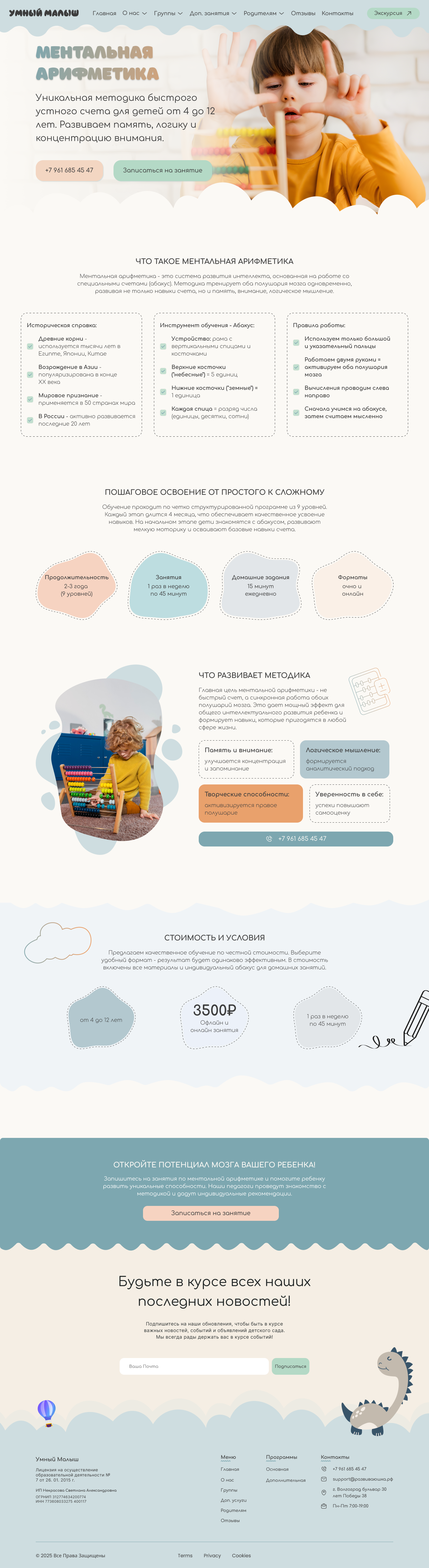 After
After
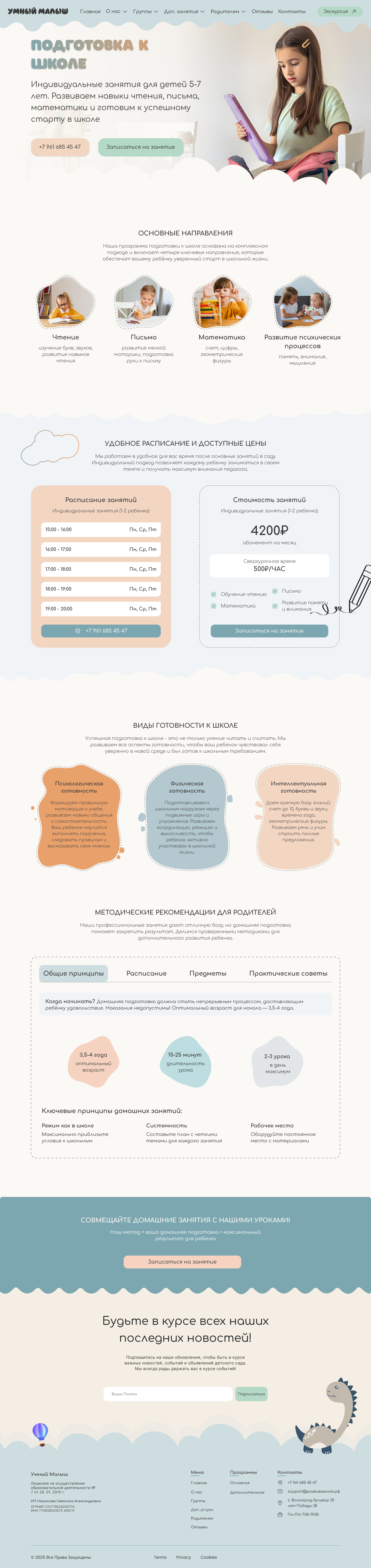 After
After
Every visual decision documented as a token — ensuring consistency now and zero design debt when the site grows. Hover over any swatch to expand.
Senior design is about the decisions you make and why. Click each to explore the thinking.
Most kindergarten sites default to primary brightness — red, yellow, blue. Bold, playful, child-facing. But the audience is parents, not children. Bright palettes signal "childcare template", not "premium educational institution".
Earthy sage greens and terracotta clay on warm cream. Warm enough to feel human, restrained enough to feel trustworthy. Designed for the person making the financial and emotional decision — not the child attending.
Everything crammed onto one endless homepage creates cognitive overload and kills SEO relevance. A parent searching "mental arithmetic Volgograd" lands on a generic page with no signal that this is what they need.
Each programme gets its own dedicated page. Focused conversion, better SEO, shareable links. Parents can send exactly the right page to their partner without explaining the whole site.
No brand photography at launch. In education, photography is the primary warmth signal. Without it, the site risks feeling clinical — all text and cards, nothing human or memorable.
A friendly dinosaur mascot and hand-drawn cloud elements run across all pages, creating visual character without a photoshoot. When photography is added, it enhances rather than replaces — no redesign needed.
Legal pages are usually afterthought boilerplate dumped in a footer. For a licensed educational institution under RF law, missing docs are both a legal liability and a missed trust signal.
Full legal documentation authored and designed to match the site aesthetic. The licensing block on programme pages — with licence number — turns a regulatory requirement into visible evidence of institutional seriousness.
Most Russian childcare sites use Nunito or rounded variants throughout — creating a wall-to-wall sameness in the category. Smart Baby needed to look different to signal that it is different.
Playfair Display as display face: editorial authority, warmth, elegance. Paired with DM Sans for UI — modern, clean, friendly. Confident and approachable without being childish or generic.
Parents choosing a kindergarten are doing so under significant emotional load. Design in this context is not about delight — it is about reducing anxiety and building confidence fast. Every visual decision has to answer: does this make a parent feel safer?
The instinct in childcare design is to go bright and playful. But the user is the parent making a financial decision, not the child. Premium aesthetics signal seriousness. Designing against category conventions is the strongest differentiator in a market where everyone looks identical.
The biggest improvement was structural — moving from a monolithic homepage to dedicated programme pages. No visual polish can compensate for poor content structure. The right content, in the right place, at the right moment in the journey is the foundation everything else builds on.
Privacy policies are usually afterthought boilerplate. For a licensed educational institution, these documents are trust signals when designed well. Turning a regulatory burden into visible evidence of seriousness is a genuine competitive advantage in the Russian education market.