A premium Japanese dining experience — designed from first impression to final reservation. Dark luxury aesthetics meet intuitive e-commerce flow.
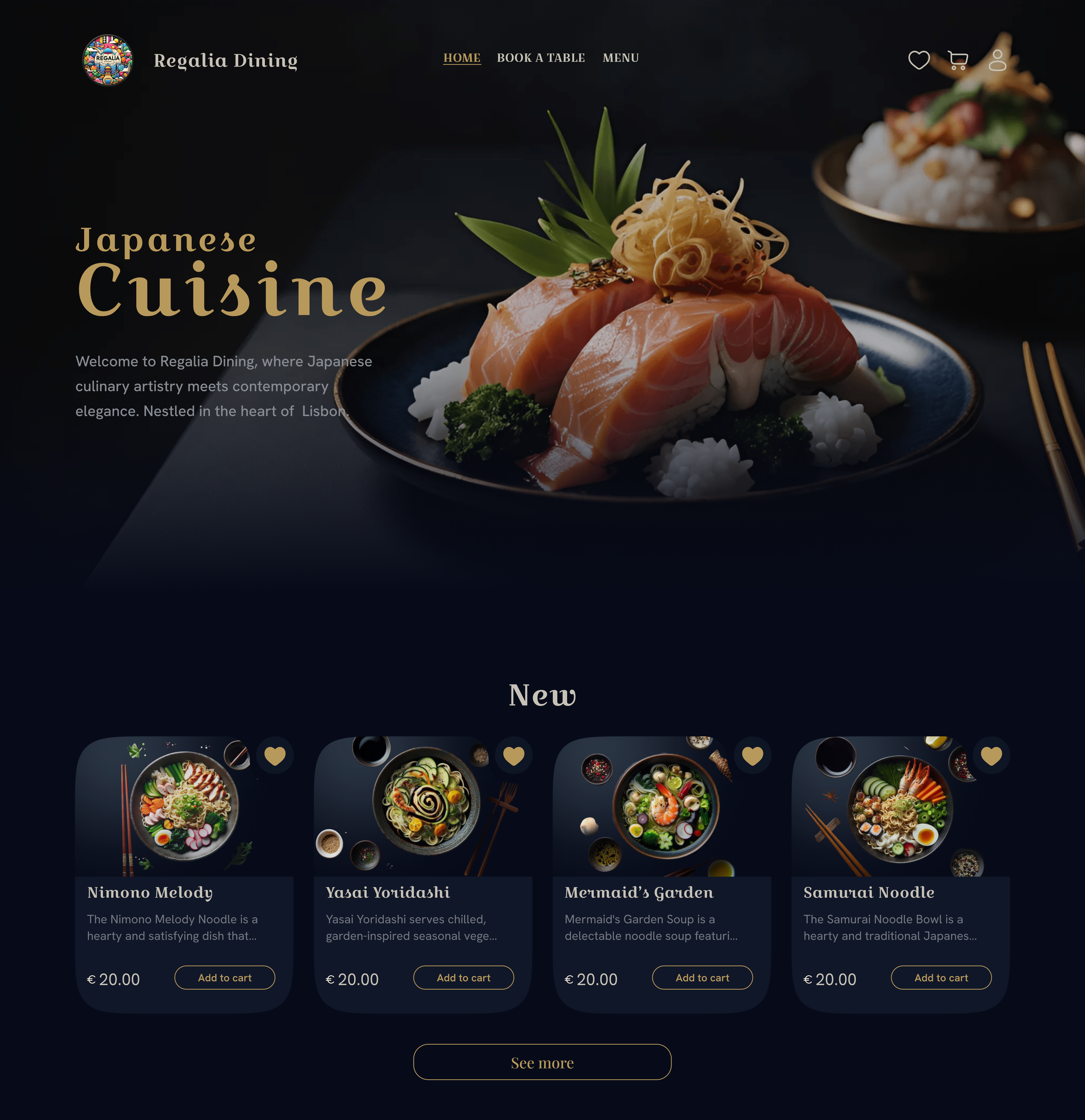
Drop hero mockup here
./img/Study case/hero-mockup.pngA premium Japanese dining experience - designed from first impression to final reservation. Regalia Dining merges dark luxury aesthetics with intuitive e-commerce flows: menu browsing, cart, favourites, and table booking, all woven into a cohesive visual system.
View Live Site ↗High-end Japanese restaurants struggle to translate their atmosphere online. Visitors land on generic templates that feel nothing like the candlelit interior. The brief: design a web presence that is as refined as the food itself.
Restaurant websites in the fine-dining segment often feel generic - stock-photo heroes, cluttered menus, no visual identity. Regalia needed a digital experience that could convert a first-time visitor into a seated guest, from anywhere in the world.
Key friction points identified: no way to browse a menu with real dish imagery, no reservation flow, no sense of place or culinary philosophy. Trust signals were missing.
A structured double-diamond process - from competitive landscape and user research through ideation and iterative refinement to a fully coded, deployable product.
Qualitative interviews with 8 restaurant-goers in Lisbon + a competitive audit of 6 premium dining sites surfaced critical gaps in the existing digital landscape.
← scroll to see more →
| Restaurant Site | Dark Aesthetic | Dish Photography | Online Ordering | Booking UX | Mobile |
|---|---|---|---|---|---|
| Regalia Dining ours | ✓ | ✓ | ✓ | ✓ | ✓ |
| Nobu Lisbon | ✗ | ✓ | ✗ | △ | △ |
| Belcanto | ✗ | △ | ✗ | △ | ✓ |
| Tasca do Chico | ✗ | ✗ | ✗ | ✗ | △ |
| Eleven Restaurant | ✗ | ✓ | ✗ | ✓ | △ |
| Feitoria | ✗ | △ | ✗ | △ | ✗ |
✓ = present · △ = partial / outdated · ✗ = absent
"When I look for a restaurant, I need to see the food first. If the website is dark and elegant, I already feel it's going to be a good experience."
"I've given up booking tables online because the forms always ask me things I don't know - like how long I want to stay. Just give me date, time, and number of people."
Two primary user archetypes emerged from research - the Occasion Planner and the Culinary Explorer. Their needs and friction points shaped every design decision.
Mapping Clara's end-to-end journey from discovery to post-visit revealed 3 critical drop-off moments - all addressed in the final design.
← scroll to see more →
| Layer | 1 · Discovery | 2 · Exploration | 3 · Decision | 4 · Booking | 5 · Post-Visit |
|---|---|---|---|---|---|
| Action | Sees Regalia on Instagram story, taps link | Browses menu, views dish photos, adds favourites | Checks date availability, reads special requests field | Fills booking form, submits, receives confirmation | Returns to site to browse menu again or rebook |
| Thinking | "This looks exclusive. Let me see if there's a menu." | "These photos are incredible. I want the salmon roll." | "I hope I don't need to call. The form looks manageable." | "Simple fields, gold button - feels right for this place." | "I want to bring my team here next month." |
| Feeling |
Curious · Cautious
|
Delighted · Engaged
|
Considering · Hopeful
|
Confident · Excited
|
Satisfied · Loyal
|
| Pain Points | Site is slow to load; no hero immediately communicates cuisine type | Competitor sites use PDF menus that don't render on mobile | Long, confusing booking forms with too many required fields | No instant visual confirmation - only a plain text response | No loyalty signal or reason to return to the website |
| Design Response | Dark cinematic hero with immediate cuisine visual identity + cuisine badge | Native card-based menu with real photography + overlay detail + favourites | Minimal 6-field form, no jargon, visible date/time pickers | Gold CTA + contextual confirmation message styled to brand | Cart persistence + newsletter opt-in on booking success |
Every screen was built to serve a specific user need while remaining visually harmonious. Dark backgrounds let food photography speak. Gold anchors the interaction layer. Click any card to expand the full screen.
A glowing dot cursor with trailing ring follows the pointer across the page, reinforcing the premium, theatrical feel. On click, the cursor expands — a satisfying confirmation of intent. Implemented in pure JS with RAF loop for 60fps performance.
The homepage presents menu categories as visual cards — each with a dish photograph and category label. A single tap takes the user directly into that menu section. The pattern prioritises speed of decision over hierarchy, letting food photography do the navigation work.
The digital product is only one surface of the brand. To create a truly holistic identity, I extended the visual language into physical touchpoints - each one an extension of the same design principles: dark luxury, gold precision, Japanese restraint.
The double-sided card embodies the duality at the heart of Regalia Dining - tradition and modernity held in the same hand. The front features an expressive photograph of the signature dish with gold Japanese Cuisine typography, creating an immediate association with the restaurant's gastronomic identity.
The reverse combines contact information with an artistic element: a flowing golden line reminiscent of a calligraphic stroke. This line doesn't merely divide space - it creates a dynamic composition with the sushi photograph, where chopsticks hold a delicate piece of salmon. Dark background and gold accents maintain the brand's premium character, making the card not just an information carrier, but a miniature work of art.
For delivery, I designed a minimalist black box with a volumetric 3D composition centred on the signature roll photograph. Golden edges create a precious box effect, emphasising the brand's premium quality - making the unboxing moment a deliberate part of the dining experience.
The Regalia Dining name appears in the same gold palette, while the dynamic composition with chopsticks holding a piece of salmon adds movement to the static form. The packaging is not a logistical necessity - it is the final act of the brand story.
In the Regalia Dining project, I created a digital experience that conveys the essence of Japanese cuisine through modern design. From the first glance at the hero section to the final touch in delivery design - each element works to create a holistic premium image, where I paid special attention to food photography, presenting each dish as an artwork on a dark background.
Golden accents, flowing lines, and organic shapes create a unified visual language that can be traced through all brand touchpoints - from website to packaging. Interactive elements and animations add dynamism without disturbing the overall harmony, while the thoughtful structure simplifies the user's journey from first acquaintance to placing an order or booking a table.
The visual system was built around a single principle: the food is the hero. Every background, colour and typographic choice serves to make dish photography sing.
Senior design is as much about what you reject as what you ship. These are the four most consequential choices made on this project.
The client brief mentioned "premium". Light themes dominate the restaurant sector (0 of 6 competitors used dark). A dark theme was a higher risk but a clear differentiation play.
Dark background amplifies food photography contrast, makes gold accents feel genuine, and matches the candlelit ambiance of the physical space. User testing confirmed preference: 6/8 testers said "this feels more expensive".
Building separate pages for each dish was more SEO-friendly, but introduced navigation friction - users would leave the menu flow to read about a dish.
The overlay keeps the user inside the browsing experience. Click a dish → overlay appears with full detail, quantity control, and cart CTA. Zero navigation cost. The in-context upsell is more powerful than a standalone page.
A plain tab bar (Appetizers · Sushi · Sashimi…) was the zero-effort option. It would have been scannable but entirely forgettable - just another restaurant navigation pattern.
Replacing text tabs with photograph-forward category cards turns navigation into discovery. Users see what a category looks like before clicking - reducing hesitation and increasing time-on-page. Each card acts as a micro advertisement for that section of the menu.
The booking page could have used the same opaque card surface as the rest of the site. A glassmorphic form risked legibility on dark backgrounds.
The blur-backed form creates visual separation while keeping depth. The transparent quality echoes the delicate, layered aesthetic of Japanese cuisine. Contrast ratios were verified against WCAG AA throughout.
A complete, deployable digital product - not a prototype. Four coded pages, a living design system, and a repeatable pattern library ready for developer handoff.
On light backgrounds, contrast is default. On dark, every type size and weight is a deliberate decision. Croissant One at 400 weight needs to be used sparingly — at large sizes it's majestic, at small sizes it becomes muddy. The lesson: test your type system at all sizes, not just in hero sections.
The visual quality of dish photography is not a "nice to have" — it is the primary conversion lever. I learned to art-direct product photography with UX intent: top-down on dark backgrounds, consistent lighting, no props that distract from the food.
The cursor trail is GPU-heavy on older hardware. Early builds caused janky scroll on low-power laptops. I added requestAnimationFrame batching, reduced trail particle count, and added will-change hints. Build custom interactions defensively from the first commit.
The CJM revealed that Booking was a drop-off point because of form length. This directly changed the design from a 10-field form to a 6-field form — cutting 40% of required input. The map wasn't a deliverable; it was a design tool.