Case Study · 2025

Braga
Redesign

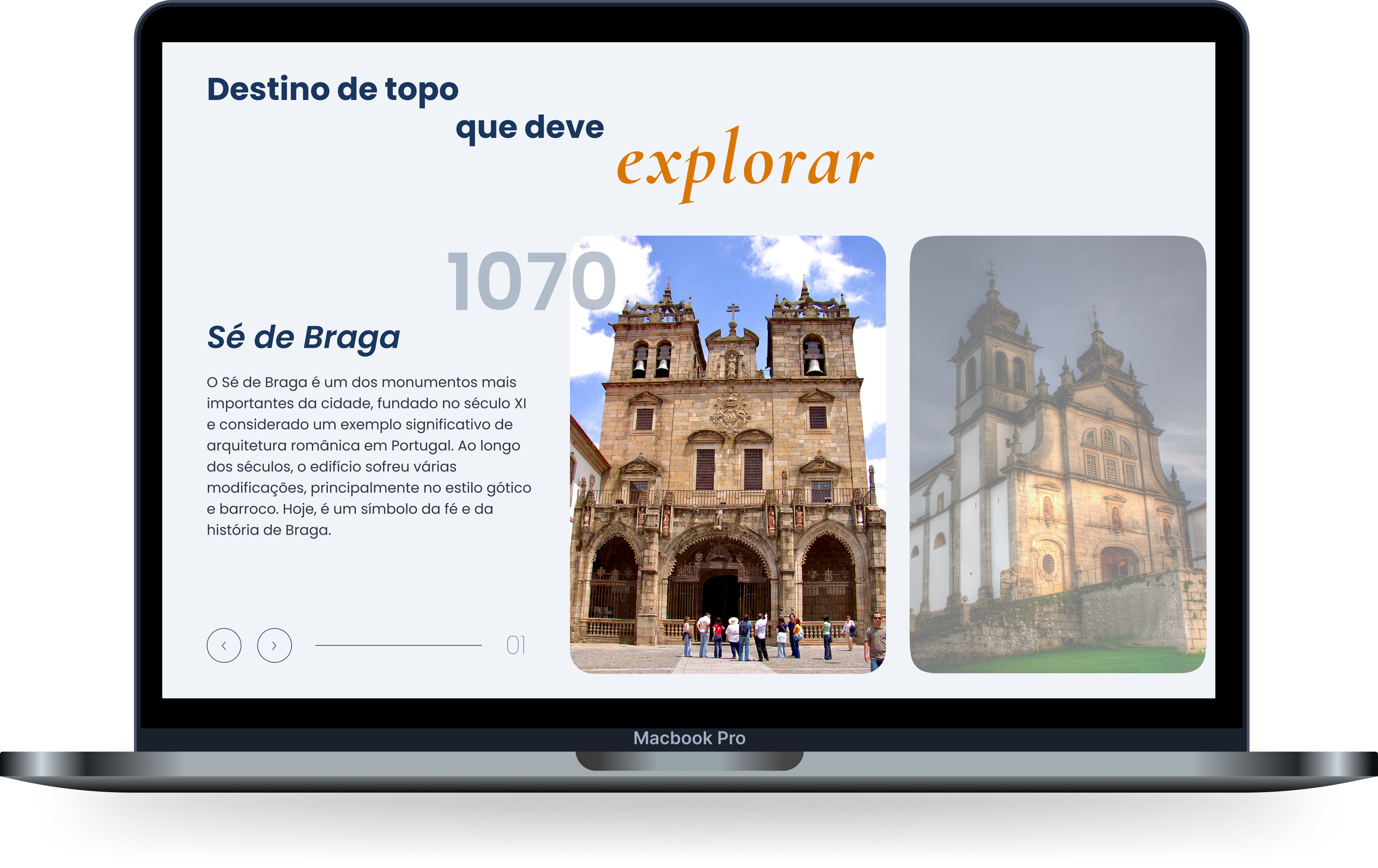
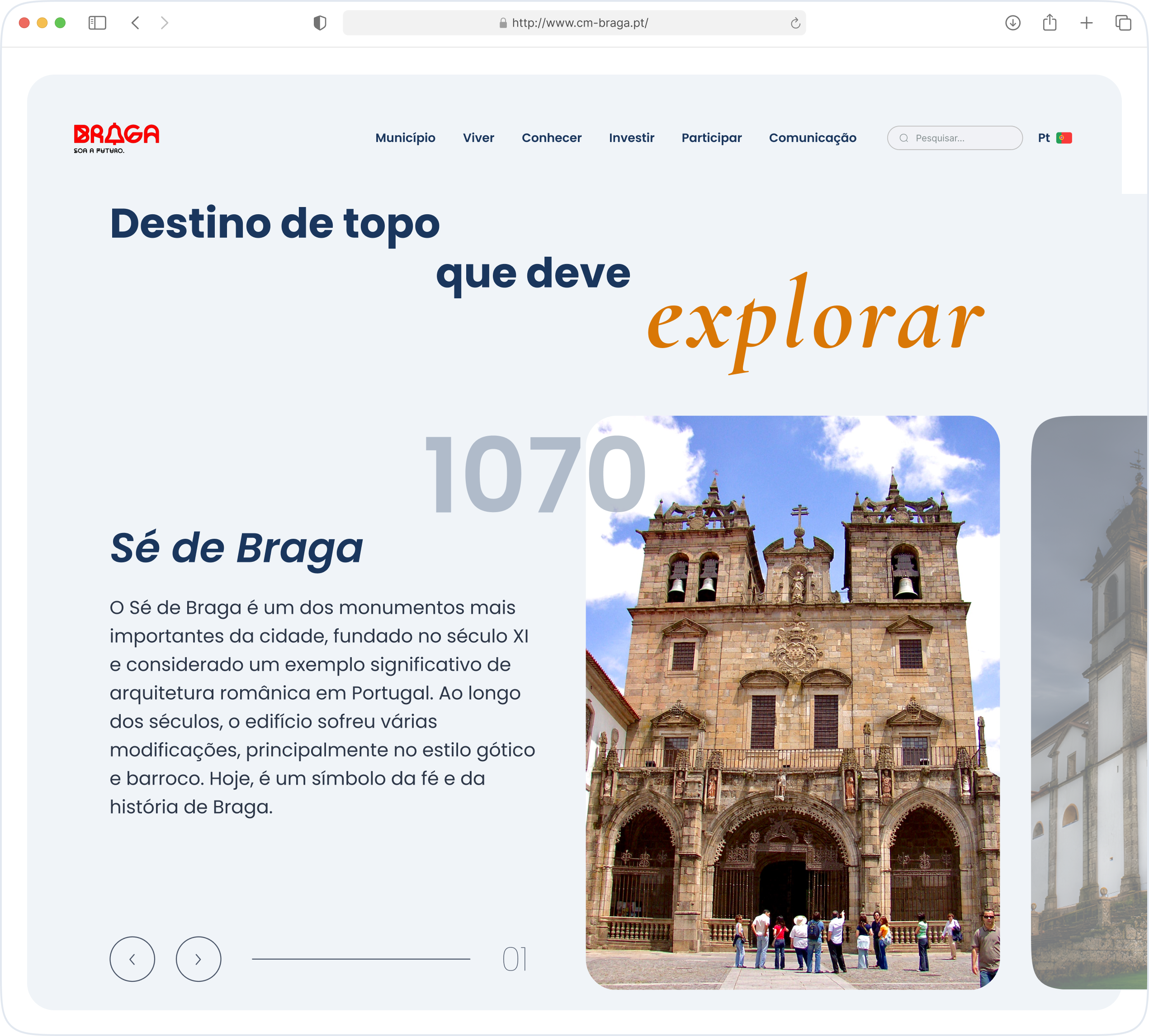
A complete UX redesign of Portugal's most historically rich municipality website - bridging 2,000 years of heritage with the digital expectations of modern citizens and tourists.

Role
UX/UI Designer
Platform
Desktop / Mobile Web
Year
2025
Live Website
Braga Redesign
Client
Município de Braga
Screens
20+
Deliverables
Research · Personas · CJM · User Flow · IA · UI · Prototype

"Where 2,000 years of history meets the city of tomorrow."

01 - The Brief

Challenge &
Goals

As a resident of Braga, I undertook this project with both professional intent and personal connection. The city's digital presence failed to reflect its unique duality - a UNESCO-valued historic city that is simultaneously Portugal's leading tech hub.

The Problem

A homepage that showed only links

The original cm-braga.pt displayed almost no content on its landing page - just a cluster of navigation links with no visual hierarchy and no indication of where each one led. Citizens and tourists had to already know what they were looking for.

Landing page = only navigation links, no content, no context
No visual distinction between residents, tourists, and business users
Mobile performance score 61/100 - 6.4s LCP on mobile
Visual identity failed to reflect Braga's rich heritage and innovation
The Solution

Bring everything to the homepage

The redesign moved key content sections - Innovation, Culture, Environment, Education, Health, Sports - directly onto the homepage. Users immediately understand the city's offer and navigate with intention, not guesswork.

Content-rich homepage with rich sectioning for every user type
Audience-first navigation: Residents, Visitors, Business
Visual language blending heritage and modernity authentically
Mobile-first layout with WCAG AA accessibility compliance
02 - Process

Design Process

From discovery to prototype - every decision grounded in research, not assumption

01
Research
& Audit
DiscoveryPerformance audit · State analysis
02
Personas
& CJM
3 personasSofia · Miguel · Teresa
03
IA &
User Flow
ArchitectureSitemap · task flows
04
UI
Design
20+ screensDesign system · prototype
05
Test &
Iterate
IterationUsability tests
Role: UX/UI Designer (Solo)
Platform: Desktop & Mobile Web
Year: 2025
Screens: 20+
03 - Audit

Current State
Analysis

A comprehensive analysis of cm-braga.pt revealed critical mobile performance failures and an interface that communicated nothing about the city. The homepage was effectively a wall of links.

www.cm-braga.pt
cm-braga.pt before redesign
Before Redesign
Lighthouse Scores
Mobile Performance
61
Desktop Performance
86
Accessibility
85
SEO
91
Mobile LCP
6.4s
Speed Index (Mobile)
9.3s
Homepage showed only links - no content, no visual hierarchyCritical
No distinction between residents, tourists, and business usersCritical
Same uncompressed assets served to mobile and desktopCritical
Outdated visual design - no cohesive identity or brand systemCritical
Missing ARIA labels on interactive elementsImportant
Events calendar completely unusable on mobileImportant
04 - Personas

User
Personas

Three distinct personas representing Braga's primary digital audiences - each with fundamentally different mental models, goals, and contexts of use.

S
Sofia
29 · Braga Resident & Teacher
PersonalityOrganised, digital-native, values efficiency
DeviceMobile-first, iPhone user
MotivationAccess civic services without visiting offices
Frustrations
Old site shows only links - no idea where to start
No confirmation after submitting requests
Needed services buried 3 levels deep in menus
Goals
Renew permits and access services from her phone
Stay updated with local news and council decisions
Find cultural events without calling the Câmara
M
Miguel
45 · Small Business Owner
PersonalityPragmatic, time-poor, results-oriented
DeviceDesktop at office, mobile on the go
MotivationManage licences and compliance fully online
Frustrations
Licence forms impossible to locate
No status tracking for submitted applications
Must visit Câmara in person for every step
Goals
Complete all municipal paperwork entirely online
Access investment incentive information quickly
Track application status in real time
T
Teresa
34 · Tourist from France
PersonalityCurious, experience-driven, researches ahead
DeviceMobile-only while travelling
MotivationDiscover heritage and plan a 3-day visit
Frustrations
Tourist content buried inside civic service sections
No English support beyond the homepage
Events calendar unusable on mobile
Goals
Find top historical sites and plan a route
Discover local events during her visit
Access the city in English without friction
05 - User Flow

Key User
Flows

Mapping critical task flows per persona revealed exactly where the old site created dead ends - and where the redesign creates clear paths to completion.

Sofia - Submit a Document Request
Homepage
Residents
Services
Documents
Fill Form
Authenticate
Confirmation ✓
Old site: 7+ taps to find the form, no confirmation state - users couldn't tell if submission worked
Teresa - Discover Events & Plan Visit
Homepage
Visit Braga
What's On
Filter by Date
Event Detail
Save / Share ✓
Old site: Events buried under "Comunicação" - tourists never found them
Miguel - Apply for Business Licence
Homepage
Old: Dead end ✗
Invest & Business
Licences
Application
Track Status
Approval ✓
Old site: No status tracking - users called the office daily to check progress
06 - Journey Mapping

Customer
Journey Map

Mapping all three personas across the full interaction lifecycle revealed consistent pain points at the same stages - confirming systemic design failures, not individual user problems.

S
Sofia
29 · Resident
M
Miguel
45 · Business
T
Teresa
34 · Tourist
Discovery Finds site via Google, hoping to renew parking permit online Referred by chamber of commerce to cm-braga.pt Googles "Braga tourism" - city site 3rd after travel blogs
Emotions Hopeful, immediately confused by the homepage wall of links Cautious optimism, quickly frustrated Excited about Braga, deflated by the interface
Touchpoints Homepage (wall of links), navigation, services section Homepage, search bar, "Município" section Homepage, news section, events calendar
Pain Points Wall of links - no idea where to start, especially on mobile Business section buried 3 levels deep, no search results Events in Portuguese only, no photos, no mobile filtering
Opportunities Content-rich homepage with clear residents entry point Dedicated Invest & Business with smart search Visual events calendar, bilingual, mobile-optimised
Design Response Homepage: news, events, services hub all visible on load Business portal with status tracking and direct contact CTA Immersive "Visit Braga" section with map, events, guides
Success Task completion without needing phone support Application submitted and status visible in first session 3+ events saved and visit itinerary formed
S
Sofia
29 · Resident
Discovery
Finds site via Google, hoping to renew parking permit online
Emotions
Hopeful, immediately confused by the homepage wall of links
Touchpoints
Homepage (wall of links), navigation, services
Pain
Wall of links - no idea where to start on mobile
Opportunity
Content-rich homepage with residents entry point
Response
Homepage: news, events, services hub visible on load
Success
Task completion without phone support
M
Miguel
45 · Business Owner
Discovery
Referred by chamber of commerce to cm-braga.pt
Emotions
Cautious optimism, quickly frustrated
Touchpoints
Homepage, search bar, "Município" section
Pain
Business section buried 3 levels deep, no search results
Opportunity
Dedicated Invest & Business with smart search
Response
Business portal with status tracking and direct CTA
Success
Application submitted, status visible in first session
T
Teresa
34 · Tourist
Discovery
Googles "Braga tourism" - city site 3rd after travel blogs
Emotions
Excited about Braga, deflated by the interface
Touchpoints
Homepage, news section, events calendar
Pain
Events in Portuguese only, no photos, no mobile filtering
Opportunity
Visual events calendar, bilingual, mobile-optimised
Response
"Visit Braga" section with map, events, heritage guides
Success
3+ events saved and visit itinerary formed
07 - Insights

Research
Insights

Key insights from the research phase that directly shaped every design decision in the redesign.

Navigation Insight
Structure mirrored the organisation, not the user
Navigation reflected internal departmental divisions. Users don't think "which department handles this?" - they think "I want to pay a fine" or "visit the cathedral." The redesign inverted this with audience-based entry points and task-oriented sections on the homepage itself.
Mental model mismatchTask-based IA
Visual Insight
Heritage and modernity aren't opposites
Braga holds two identities - ancient Rome of Portugal and Portugal's tech capital. The visual language needed to honour this duality: editorial serif for heritage, clean sans-serif for function, warm gold and navy rooted in the city's own palette.
Dual identityTypographic contrast
08 - Information Architecture

Site
Structure

The new IA was designed around three distinct entry audiences - replacing the department-based structure with a user-mental-model approach.

Homepage Residentes Visitar Braga Serviços Online Investir & Negócios Município Documentos Multas Notícias Monumentos Agenda Cultural Restaurantes Formulários Pagamentos Estado do Pedido Licenças Incentivos Contato Direto Câmara Municipal Publicações Transparência Resident & Civic Tourism & Business Sub-pages (civic) Sub-pages (tourism)
09 - Design System

Visual
Language

A design system built from Braga's identity - navy from institutional heritage, gold from Roman foundations, green from the Minho landscape.

Primary Blue
#2B5CE6
Roman Gold
#D97706
Gold
#C4973A
Limestone
#F7F5F2
Typography
Playfair Display
Inter - For all body copy, labels, UI elements, and navigation. Clean, legible, WCAG AA compliant at all sizes.
Type Scale
Hero · 88px
Heading · 48px
Body · 16px · Inter Regular
LABEL · 11PX · INTER SEMIBOLD
Braga Homepage Redesign

10 - Homepage

Everything visible from the first scroll

Heritage · News · Events · Clear entry points

Where the old site showed only navigation links, the redesigned homepage surfaces real content immediately - hero with news sidebar, "Bem-vindo a Braga" narrative, photo carousels, and direct entry into the city's key topics: History, Innovation, Culture, Sports, Health.

Audience-first navigation
Three clear entry points - Residents, Visitors, Business - replace the old department-based menu.
News + events above the fold
Live news sidebar with tabs (Notícias, Agenda, Destaques) replaces static link lists.
PT / EN bilingual toggle
Always visible - serves both residents and international visitors from the first pixel.
Braga Heritage Redesign

11 - Conhecer · Heritage & Tourism

2,000 years told through design

Sé de Braga · Bom Jesus · Braga Romana

The redesign brought Braga's rich heritage directly onto the homepage - full-bleed monument photography, a "Bem-vindo a Braga" narrative section, and a horizontally scrolling Destinos de Topo carousel showcasing Sé de Braga, Bom Jesus, and the city's iconic landmarks.

Monument showcase cards
Sé de Braga (founded 1070), Bom Jesus do Monte, Braga Parque - with photography, dates, and descriptions.
Swipeable photo carousels
"Braga: História e Modernidade" section with carousel and Saiba Mais CTAs on every section.
Braga Innovation Redesign

12 - Inovação · Cultura · Ambiente

All city topics, one scrollable homepage

Innovation cards · Cultural events · Green initiatives

Innovation (nanotechnology, tech companies), Culture (Braga Romana, São João festival, exhibitions), and Environment (sustainability, green spaces) were previously buried link pages. The redesign surfaces all of them as distinct, visually rich homepage sections with cards, photos, and event listings.

Innovation section
INL Nanotechnology Laboratory, Tecnologia de Ponta, Empresas Inovadoras - each with image and CTA.
Environment section
Braga + Verde, Eco-Escolas, Mobilidade Sustentável, Reciclagem - sustainability made visible and navigable.
Braga Health Redesign

13 - Educação · Desporto · Saúde

Citizen services brought to the surface

Universidade do Minho · Estádio · Hospital de Braga

Education (35,000+ students, 95% literacy), Sports (Estádio Municipal, SC Braga, Próximos Eventos Desportivos), and Health (12 centres, 1,500+ professionals, emergency contacts) are now surfaced as full homepage sections - with stats strips and always-visible emergency numbers.

Education stats strip
35,000+ students · 80+ schools · 95% literacy · 150+ projects - Braga as a knowledge city, made visible.
Emergency contacts always visible
112, Bombeiros Sapadores (253 609 230), Proteção Civil, PSP Braga - prominent footer strip, every page.
14 - Outcomes

Projected
Impact

Based on competitor benchmarks and established UX research principles, the redesign is projected to deliver measurable improvements across all three user segments.

+40%
Mobile task completion
From simplified navigation and performance improvements - mobile LCP target 90+.
−60%
Phone enquiries to the Câmara
Services hub with live status tracking removes the need for follow-up calls on submitted applications.
+85%
Tourist content engagement
Visit Braga section with visual calendar and bilingual support replaces buried text-heavy pages.
15 - Reflections

What I
Learned

A civic design project carries responsibilities that commercial ones don't. Every decision affects citizens' ability to access services they depend on.

Design Principle
Visual identity must be earned, not borrowed
Generic government-site aesthetics would have been easier. Instead I spent time understanding Braga's specific character - Roman heritage, baroque churches, nanotechnology institutes - and let that shape the colour palette, typography, and imagery direction authentically.
Next Steps
Usability testing & iteration
The next phase would involve usability testing with all three persona groups - specifically testing the services hub task completion rates and tourist event discovery flow on mobile. Every assumption in this redesign is a hypothesis waiting to be tested.